Giovanna Gowmez
Game Designer
Projects
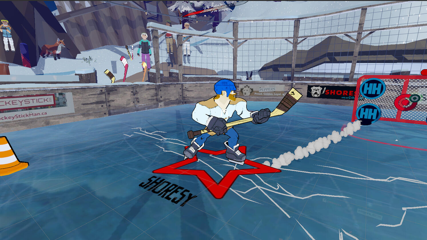
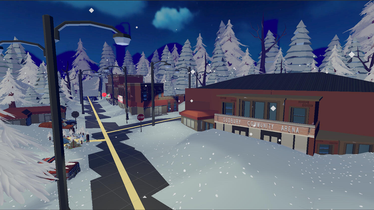
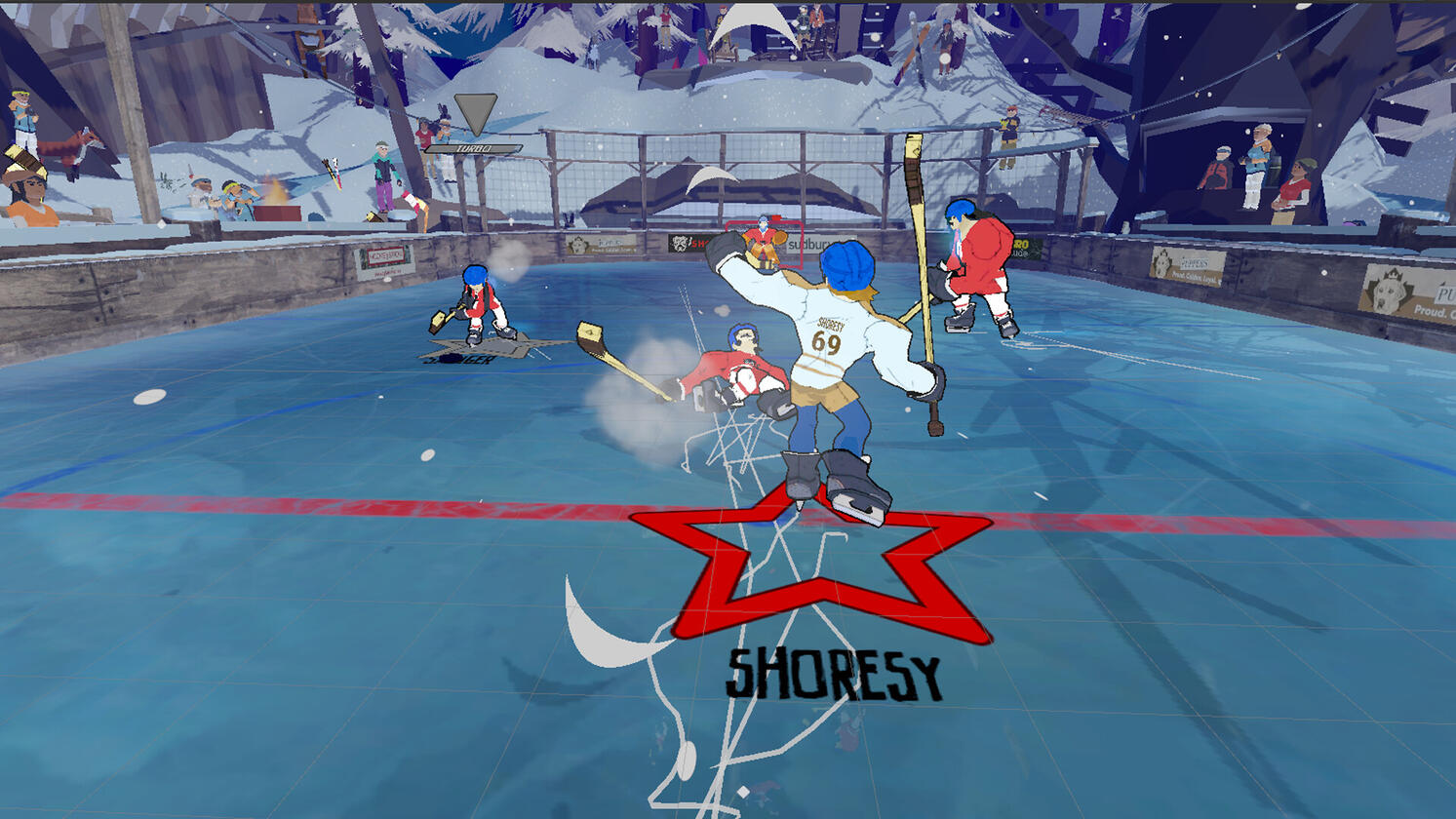
Shoresy: Legends of the North
Treewood Games | January 2024 - May 2025
Role: UI/UX Designer
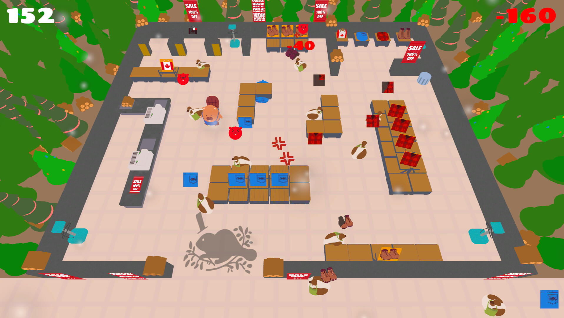
Genre: Single-player and local multiplayer, hockey RPGBased on the Canadian comedy tv series Shoresy, experience a fast-paced and over-the-top hockey game that will "set the tone."
Student Projects
Fishy Business
VFS Student Final Project | April 2023 - August 2023
Role: Game Designer, UI/UX Designer
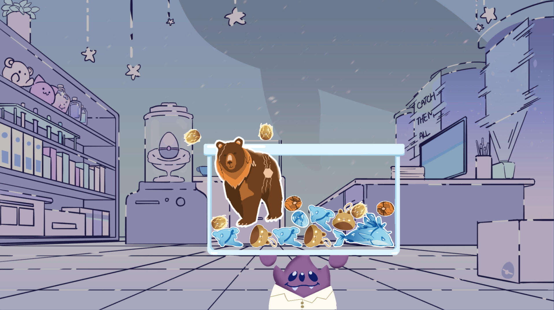
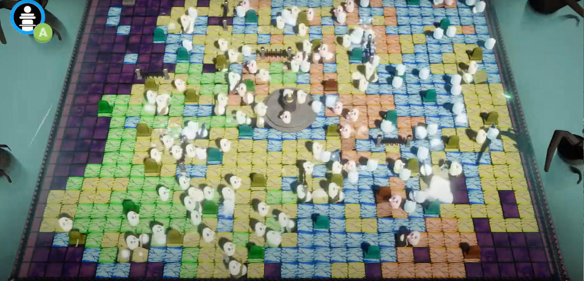
Genre: Online, free-for-all, party, multiplayer gameOn the frozen glacier, there are no laws. In this 3D, online, party game, players play as a penguin parent, who is trying to make sure that their babies are well fed. Fish the fishes or steal them from others, but make sure that your baby is well fed to become the ultimate penguin parent.
Graffiti Wars
VFS Student Team Project | January 2023 - March 2023
Role: Game Designer
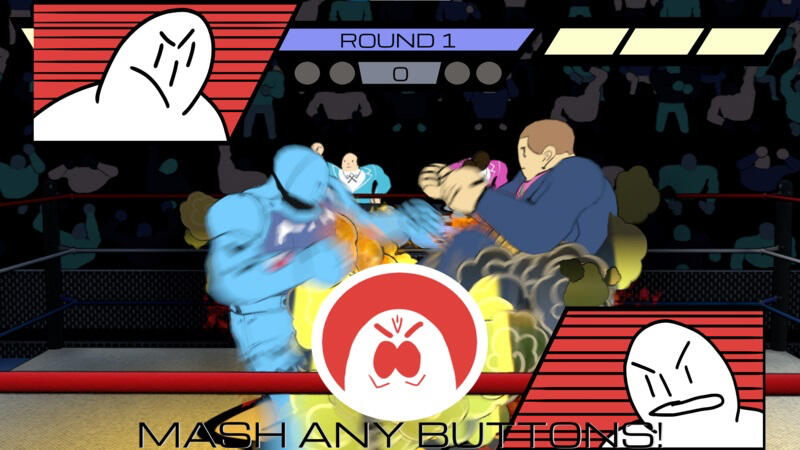
Genre: Local, Co-op, multiplayer gameSchool's out and it is time for the children to play! In this 3D, 4 players local multiplayer, party game; players play as kids who wish to graffiti the whole school with their art. Play as a Painter to decorate the school and avoid the Cleaners; play as a Cleaner to clean up the opposing artist's art and stun Painters to prevent them from painting more.
Game Jams and Personal Projects
Beyond Life & Death
Otome and Josei Game Jam | May 2025 - July 2025
Role: Developer
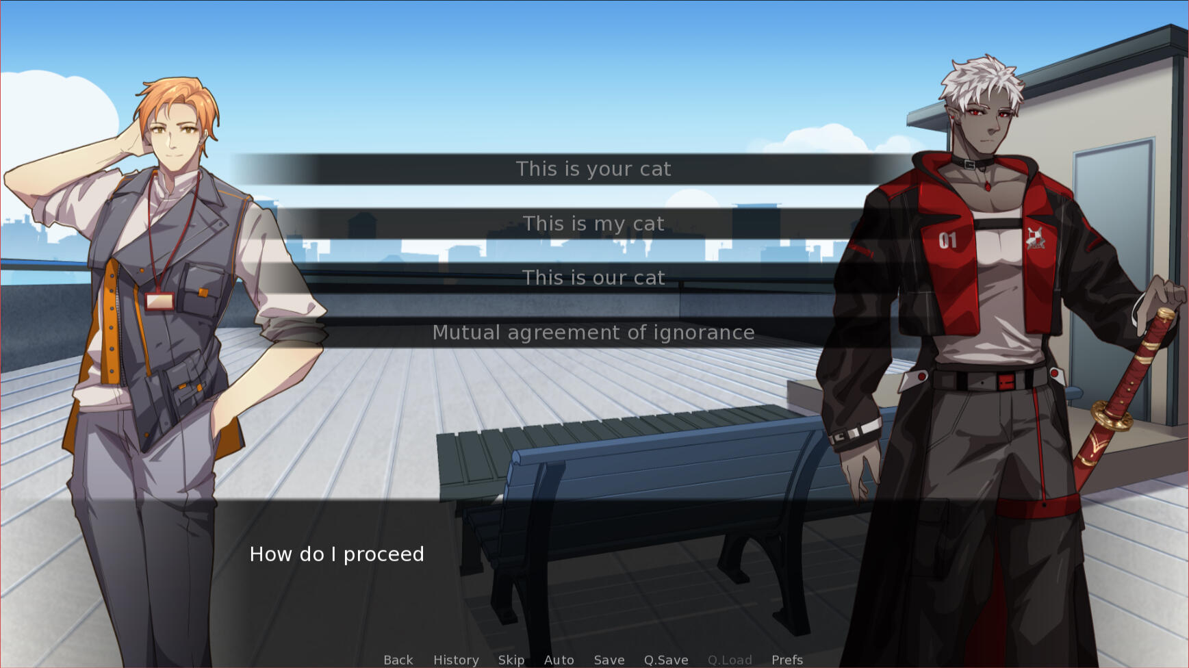
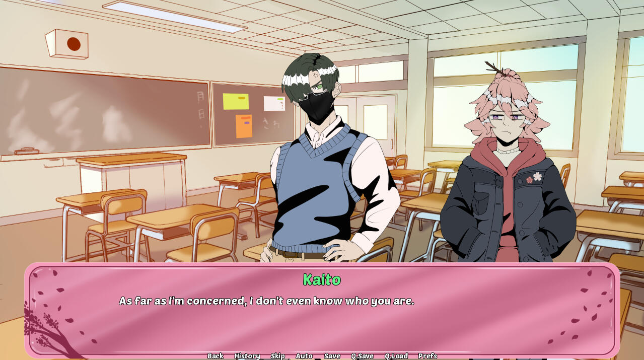
Genre: Single-player, dice-rolling, dating simBeyond Life and Death is a dice rolling Otome game, where you play as Pryce, a girl who has made a deal with the reaper to find love within 48 hours or not she will die -- again. Find love, roll and choose options to gain approval; and get that kiss! Just make sure that Pryce doesn't fumble too much into crying and scare them off.
Heart of the Arsenal
VFS Game Jam | June 2023
Role: Narrative Designer and Artist
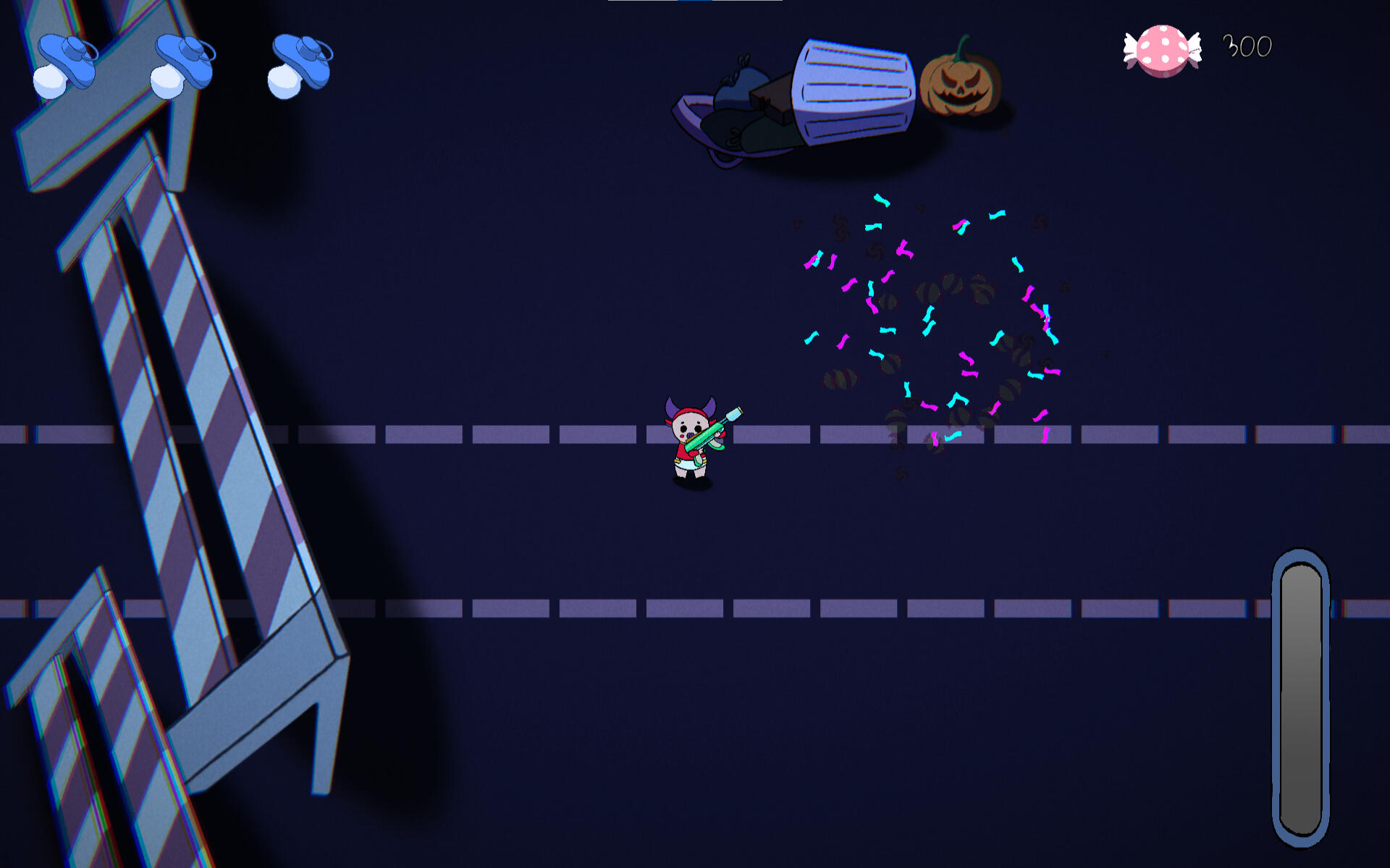
Genre: Single-player, aim-trainer, dating simShoot to impress in this aim-trainer dating sim, where you play as a humanoid gun trying to join a group of elites to win the love of your life.
More Game Jams on Itch.io
Design Blog Highlights
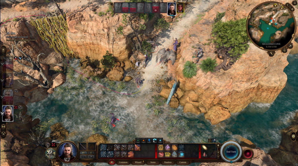
Designing Different Difficulties: Baldur's Gate 3The analysis on Baldur's Gate 3 different difficulties -- from Explorer mode (easy) to Honour mode (nightmare)
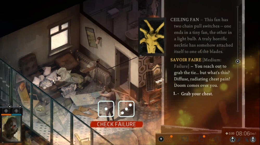
Designing Failure: Disco ElysiumExploring how Disco Elysium treats failure in their design, and the outcomes of the failure feedback.
Machination Breakdown: A Dark Room – Part 1. Solo GatheringPart 1/2 of using Machination to understand the system of A Dark Room.
More Studies on Design Blog
Coming Soon
Comic Book Meets Classic Arcade Hockey Game
The main design pillar for Shoresy: Legends of the North is to create a hockey game that has the energy of the old arcade-style hockey games like Wayne Gretzky's 3D Hockey (N64), NHL 94 (SNES), and NHL Hitz 2003 (PS2); and taking inspiration from contemporary Canadian culture and media, especially from western cartoons and references to the Shoresy tv show.As the UI/UX Designer in the team, my goal is to incorporate the classic UX structure from the old hockey hits with modern UX philosophy and best practices in games; while taking inspiration in the UI, from the comic book structure and layout panels of superhero comics such as Invincible, My Hero Academia (僕のヒーローアカデミア), and Scott Pilgrim.
Design with and for Accessibility
The process of designing a feature with accessibility in mind.
Designing the Gameplay Interface
The design of the gameplay interface from start to finish.
Iteration to Perfection - Team Draft Screen

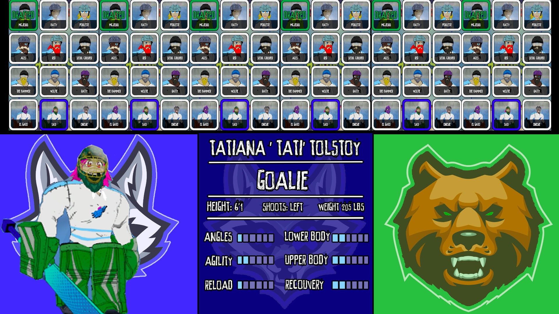
The team drafting interface when I first started.
The screen that had the biggest change and iteration is the team drafting screen. In this screen, players get to choose which team member they would like in the game and take turns drafting the characters.The interface required players to understand:
1. Which team the players are in, including the team colour/logo
2. Who can be drafted
3. How many people each team has drafted
4. The stats of each character
5. Whose turn it is to draft.
The Challenge: managing a large amount of information in one screen
This screen has the most information that is required to be displayed to the player, compared to all the other screens. Players can choose from a wide variety of characters, and get to build their team the way they like it to be.Due to the main focus of drafting the characters, in the first iteration, I put the emphasis on that by allowing the roster to fill half of the screen. The other half is allotted to the actual character that the player has hovered over and showing their stats.The character preview will move to the other side of the screen, in front of the opposing team's logo, to indicate that it's the next team to choose who gets to go next.This design did not suit the needs of the project due to the lack of information in which players have already been drafted and had too much available characters too choose, as we had less than what is emphasized in the mock up.

The first iteration of the team drafting interface. This layout maximized the amount of players available to choose.

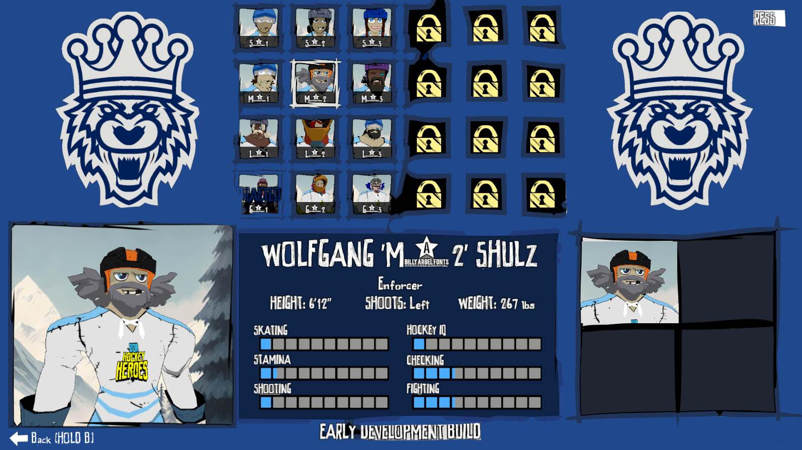
The second iteration of the team drafting interface, where the players colour and logo would take up the entire screen, depending on whose turn it is to choose.
Almost got it?
Knowing the issues with the previous screen, I got to laying out the next iteration. In this screen, the available players to choose is accurate to the actual roster, and shown which character have been already drafted on the bottom right.Players on the same team can control this screen, and once they are done, the screen will change colours and logo to indicate the next team can choose.This layout worked as it served everything that is important to the team drafting screen. However, this was before I read the Game Accessibility Guideline.After reading the guideline, I realized that by switching the colours of the screen and logo, there would be a potential for flashing lights -- as players tend to choose the next character quickly once they gained control of the screen. I did not want to cause a potential epilepsy attack on our players, so I had to change the design to prevent that.
Final Iteration with Accessibility in Mind
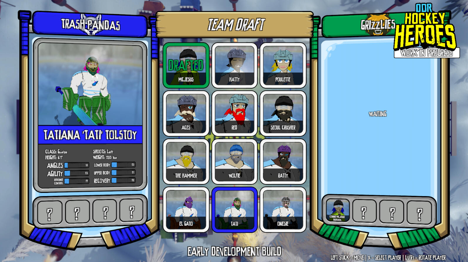
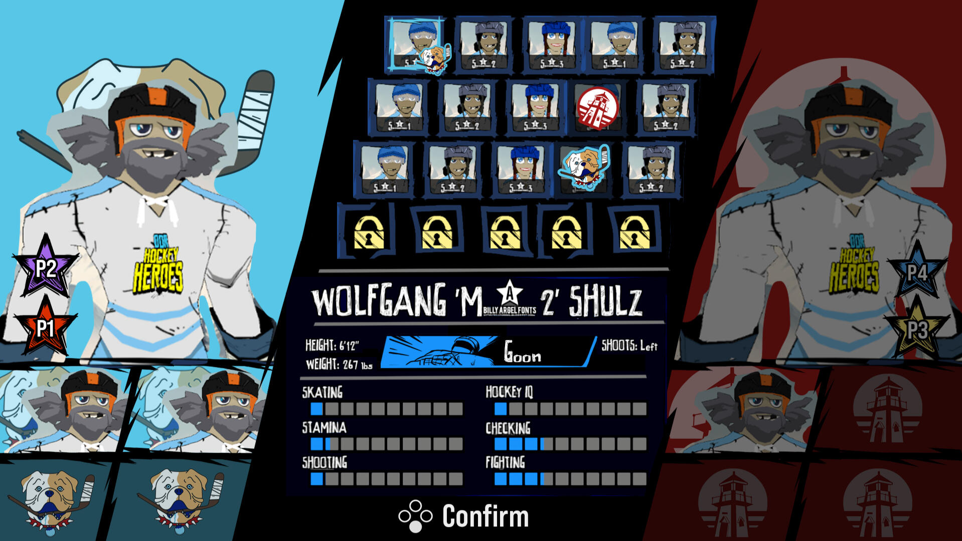
In this Iteration, my main goal was to incorperate what I learned from the Game Accessibility Guideline, and rework the team drafting screen according to the guideline.I chose to do something in-between the first and second iteration of the screen. The first iteration did not have the colour switching based on the team in control, so I took that design and placed it in to rectify the flashing colours of the previous iteration. This required both teams to be on the screen, so I moved the drafted characters under the character preview of the team's logo and hovered character.The design of this screen is based on dividing the screen into thirds, and having the left side be one team, right side be another team, and the middle is neutral ground.The left side and right side is assigned to one team, and has all the current information of the team:
1. The team logo and colour
2. The players assigned
3. the drafted players
To indicate whose turn it is, the team not under control has a darker filter on them.In the middle, I placed all the information that is not locked to a specific team, so the characters available to draft, their stats, and controls.

The final iteration of the team drafting interface, where it is a mix of the first iteration and second iteration.

The final iteration of the team drafting interface, where it is a mix of the first iteration and second iteration.
The Conclusion
The Design of the Gameplay Interface

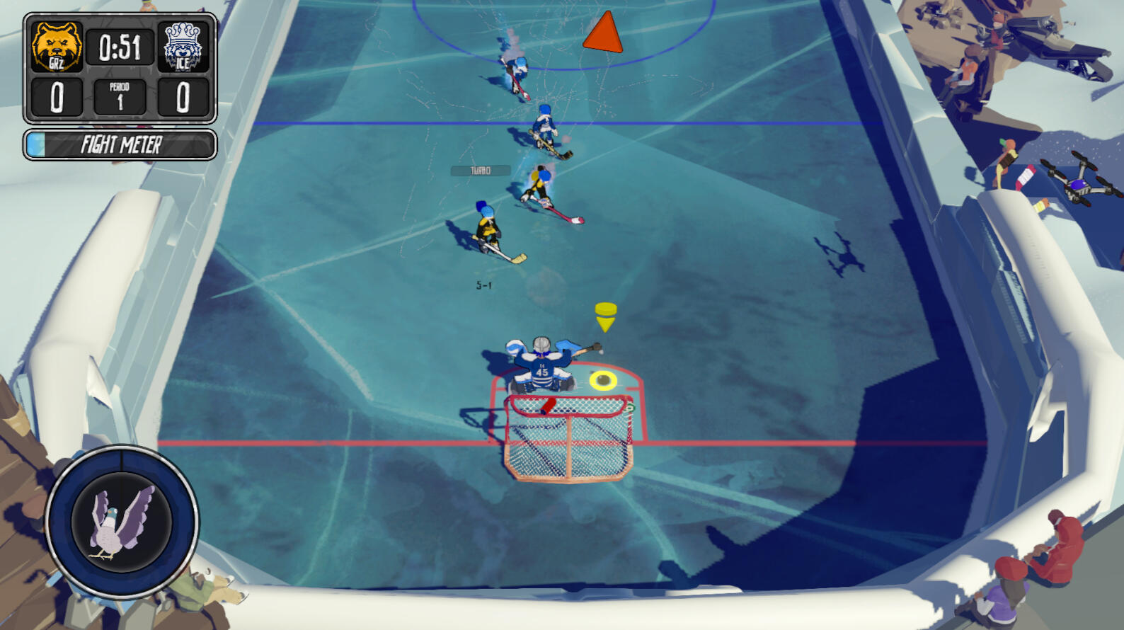
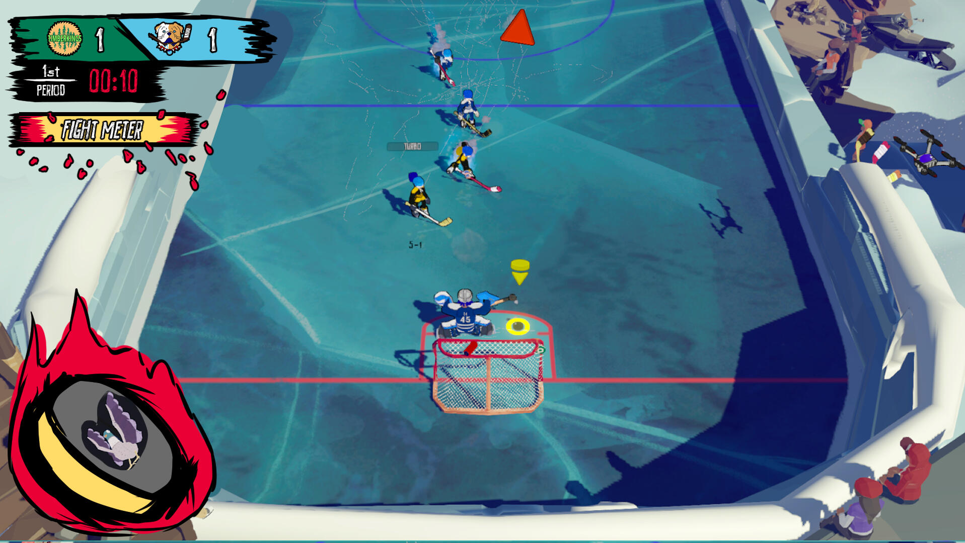
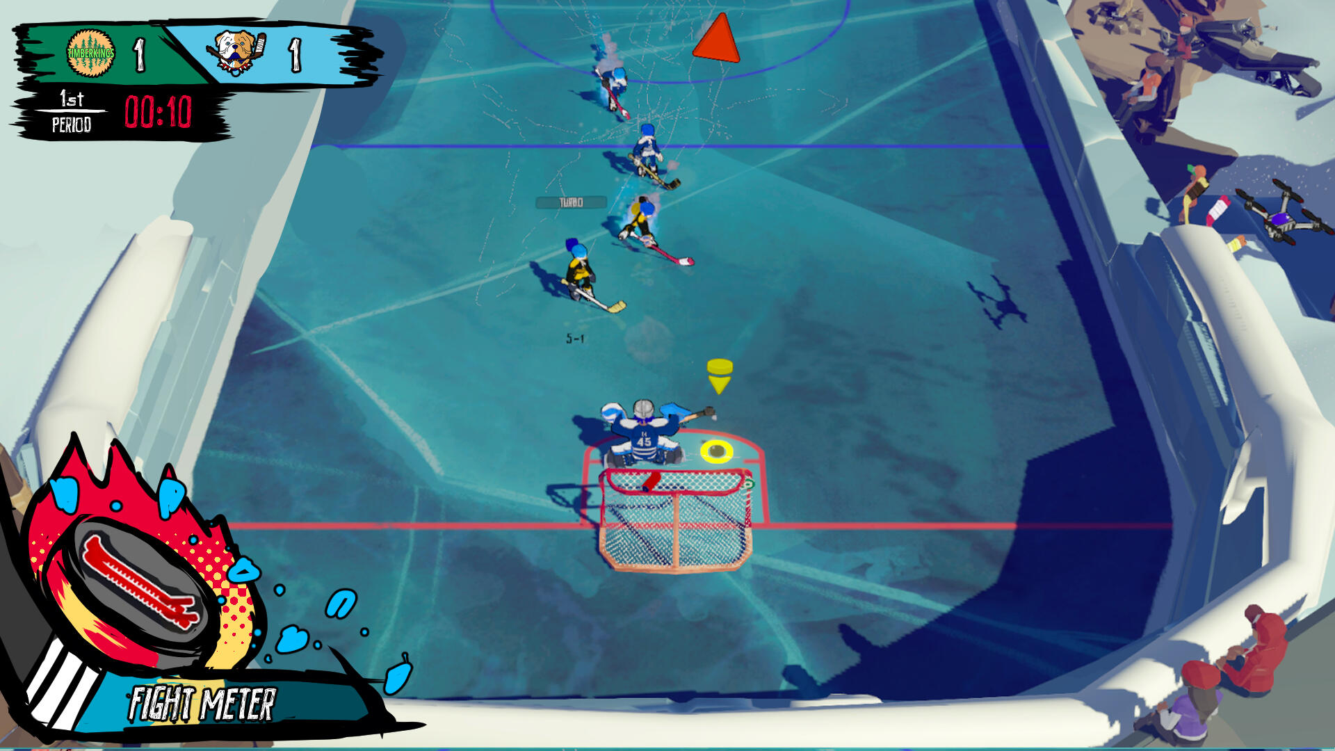
The interface of the game when I first started the project. On the left side of the screen is the score, fight meter, and power up. On the centre, is the player indicator and the puck marker.
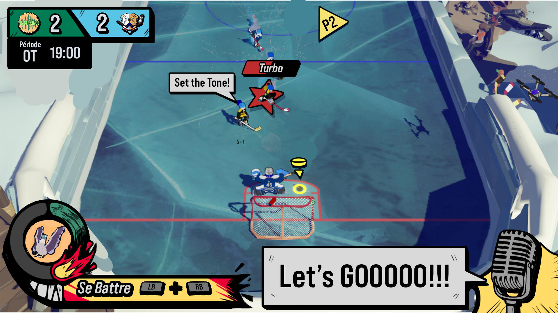
In the team, I was responsible for updating the interface to suit the comic book style of the game, and make adjustments to the current structure of the screens to clarify the information that is being passed to the player. One of the critical screens that the player will encounter is the gameplay -- the face of the game and what would draw players in to play and continue the game.The score in the top left defines the teams, current score, period, and time. Under the score, the fight meter indicates how much of the bar is filled for the player to start a fight event. On the bottom left, is the power up to show what power up is at play during the moment; both teams can grab a power up. The red triangle on the top indicates a player off screen, and the yellow indicator beside the goalie is the puck marker.Currently, the interface is decent but needs refinement:
1. The interface aesthetic no longer serves the theme of the game
2. The score interface does not effectively fill the space allotted
3. In-world interface is difficult to see
4. Information that directly alter the course of the game, the fight meter and power ups, are not grouped togetherPoint 1 and 3 are easily rectified through recreating the asset in the current style of the game, but Point 2 and 4 require readjustment in the interface's design.
The Challenge: Maintaining the feature structure of the previous design
Due to time constraints, my design challenge is to limit the amount of new UI/UX features that is implemented throughout the entire game. This means that I had to work with the current mechanics of the interface feature, and find ways to clarify the information without having to code in new designs unless it is crucial to the player's experience.The best way to solve the current issues in the interface, is to move the elements around to solve the issue and find ways to group them together.

Directly updating the UI to fit the style of the game does not solve the problem of the fight meter and power up in one location. The information is still being split between two places and does not spread the information evenly around the screen.

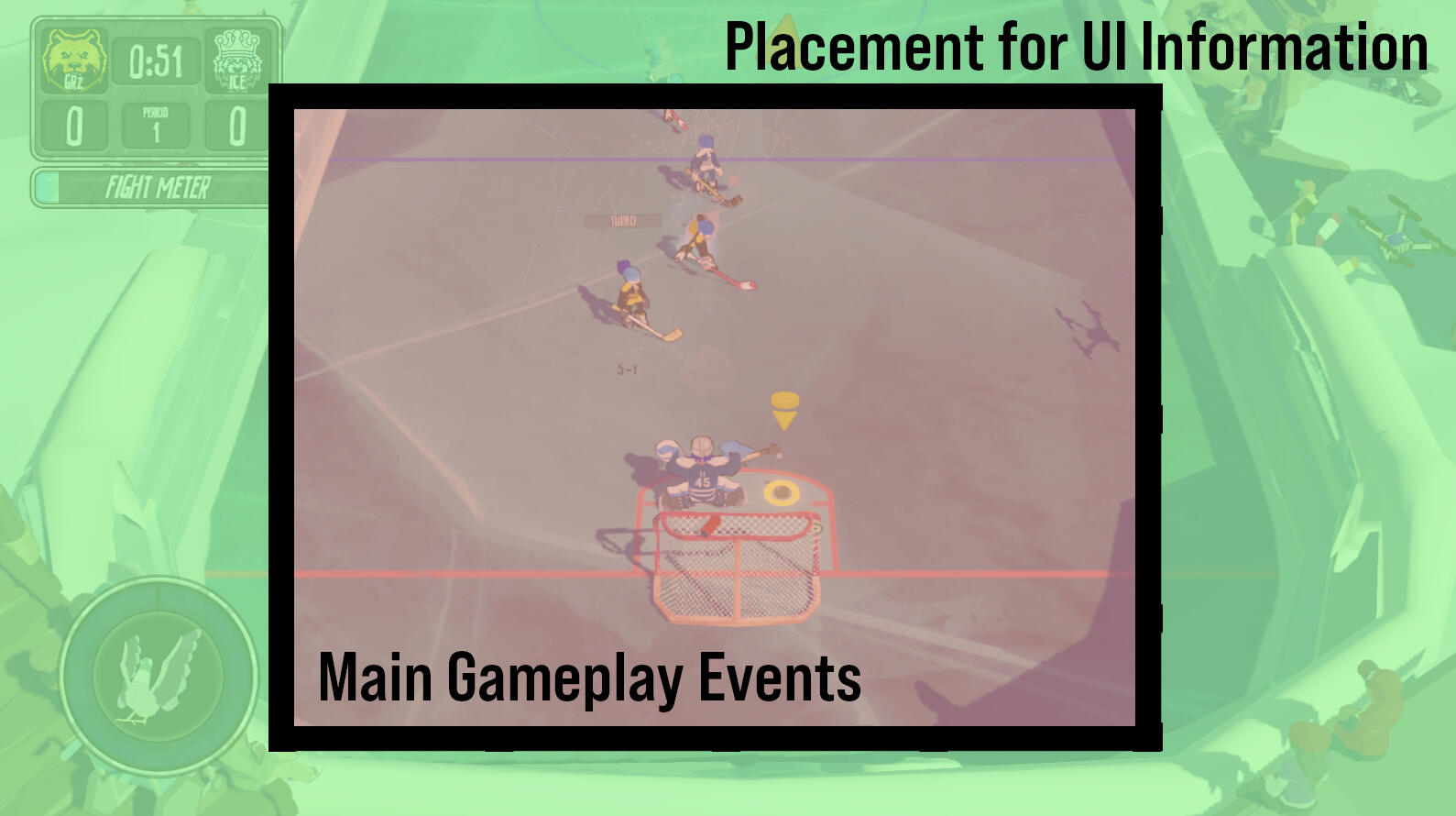
The areas of gameplay. This is based on where the most activity will be during the game. The red is where major gameplay events happen, and the green is where gameplay events barely or never happen.
Areas for information
The first thing I did was analyze the game space and where activity happens the most. Each game has different areas of activity, but generally the centre of the screen is where most of the game happens.Indicated in red, is the information that are on the centre of the screen are the most important: gameplay events and UI relevant to the current situation of the game. Indicated in green is information that are closer to the edge of the screen are details that players should be informed about, but is not always crucial to the current beat of the game.When placing UI in the screen, I found that the best way to inform player during gameplay is to keep the details closer to the edge of the screen, rather than in the centre -- unless it is a change of game beat in the session, such as an end of game or an event that changes the focus of the players.
Grouping of Information
The current UI follows the quadrants, but the issue is how the information is grouped together. In the original interface, the score and fight meter are placed at the top-left while the power ups are placed at the bottom-left. This set up is acceptable, but the score and the fight meter do not correlate with each other; the fight meter is an activatable feature, by the player, to start a fight anytime during a period if they have filled the meter.The power up and fight meter should go together, as they both are obtainable by the player and will affect the course of the game. By grouping the power up and fight meter together, this gives more room for the score to hold information.

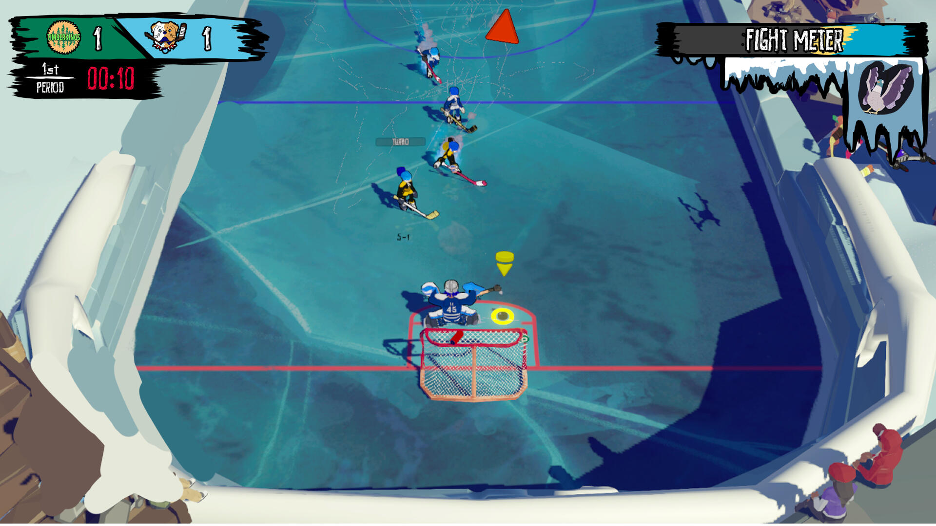
Experimentation of grouping information v1: top right where the fight meter and power up is in line with the time and score.

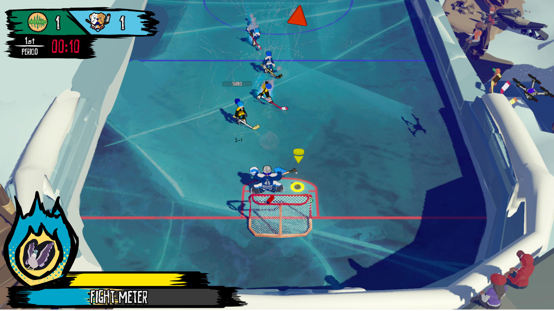
Experimentation of grouping information v2: the fight meter and power up is together on the bottom left, and the power up is a bar rather than a circle.

Experimentation of grouping information v3: follows the same positioning and structure of v2, but the power up is a puck and the fight meter is a stick.

Power up indicates which team got the power up based on the fill and background colour, and logo on the corner.

Fight meter shows the button prompts to activate the fight; mock up is cleaned up to illustrate the quality of the assets in game. Removed the logo on the corner of the power up to simplify the information, as each team has unique colour variations.
Additional Features
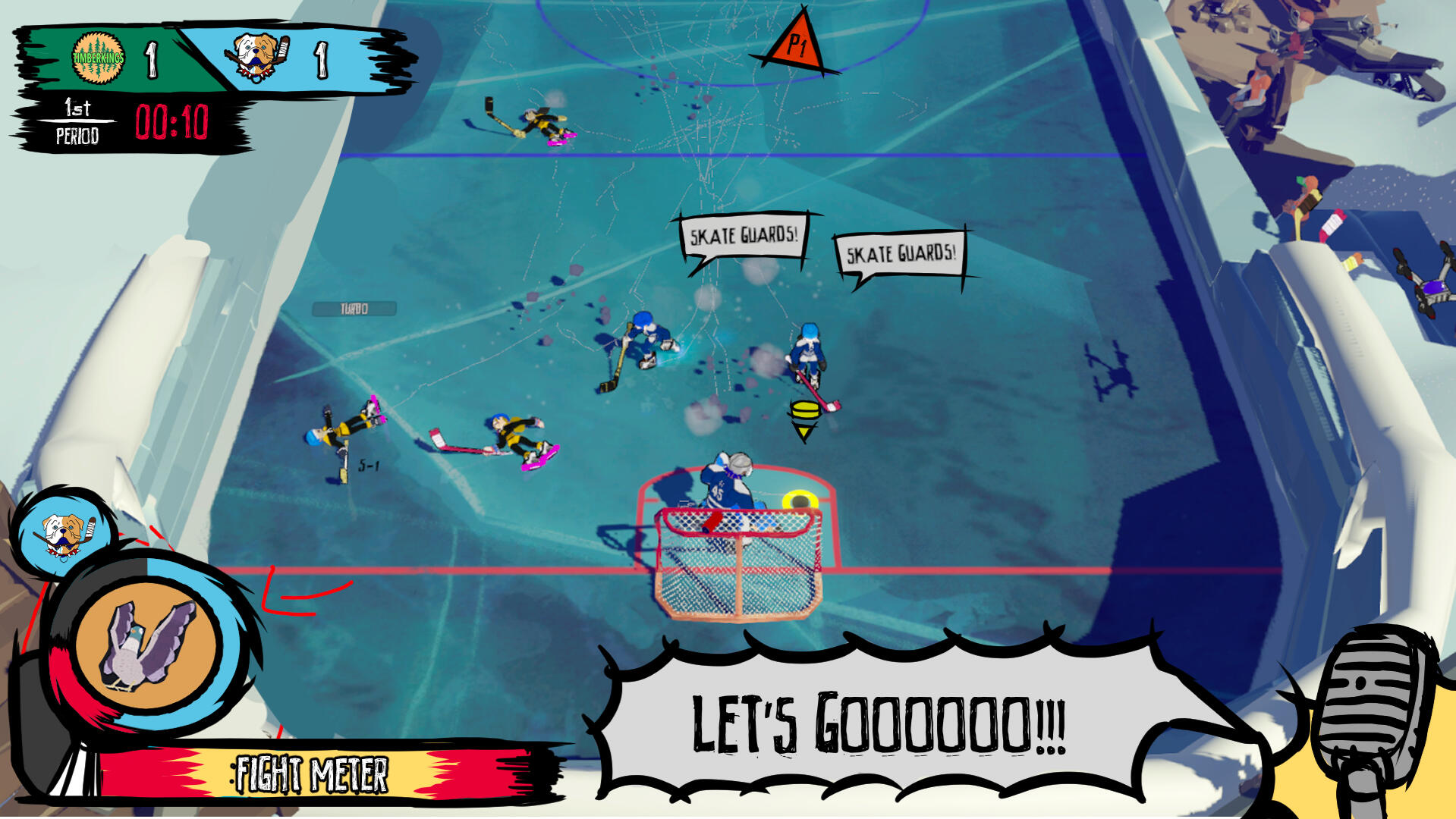
Once the main issues of the interface structure is fixed, I proposed two new features that will improve the clarity of information that is being passed to the players:1. The power up changing colours, based on which team picked up the power up, allowing players to understand if the power up is for or against them
2. The fight meter showing the controls during a full fight meter bar, allowing players to understand that they have the ability to activate a fight and how they can activate it in the moment
3. Mic in the corner to call out key gameplay events such as a goal or specific tricks the player have done.These features require a few lines of code in the existing structure, and adds on information that is missing in the previous interface.
Conclusion
Once the interface is solidified, I have an outline on what assets need to be created and how they should be designed to seamlessly integrate with the code. The game will release with multiple languages and platforms, so I approach my asset design to accommodate: limit the words on screen and ensure there is a large amount of space for additional letters, and simplify the assets for clarity at a distance.Through the adjustments in the UX and UI, the gameplay interface reads clearly and clearly communicates the information for players, during fast-paced hockey period. At a glance, players can easily identify the status of the game without having to pull them away from the gameplay to decipher the information displayed.

The previous game interface.

The current game interface after the adjustments. Some of the text is written in french and english to test the clarity of written information in different situations.
Designing Accessibility Features

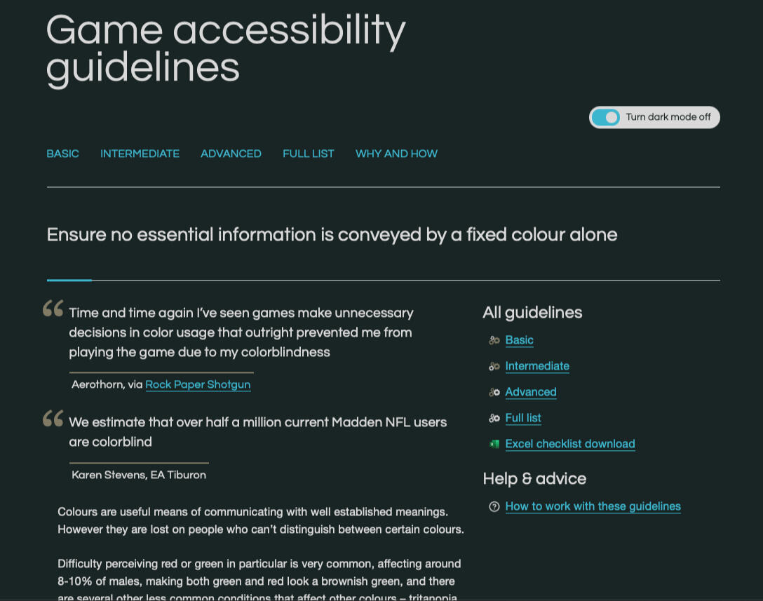
The Game Accessibility Guidelines website, in the topic about essential information not only being reliant on colour.
This was my first time designing a feature that is for accessibility. When I don't know how to design something, I turn towards research.I attended panels about accessibility, read up about the common issues and experiences people had with games, and read patents on how EA designers approach the problem.The Game Accessibility Guidelines has been the most helpful in this part of the process as it detailed which features affect certain disabilities, how much work is needed, and how many people would use it. Everything on the site spans through multiple game genres, including accessibility features for VR and voice chat; the game does not have VR or voice chat, so not all the guidelines is relevant to the game.
Defining the Critical Accessibility Features
In the research, the critical accessibility concerns for our game:
- Motor: The ability to remap the buttons
- Difficulty Reading: The ability to change text size -- or ensuring all text has a minimum of 28px font
- Colour blindness: The ability for players to understand which team and player they are playing at all times
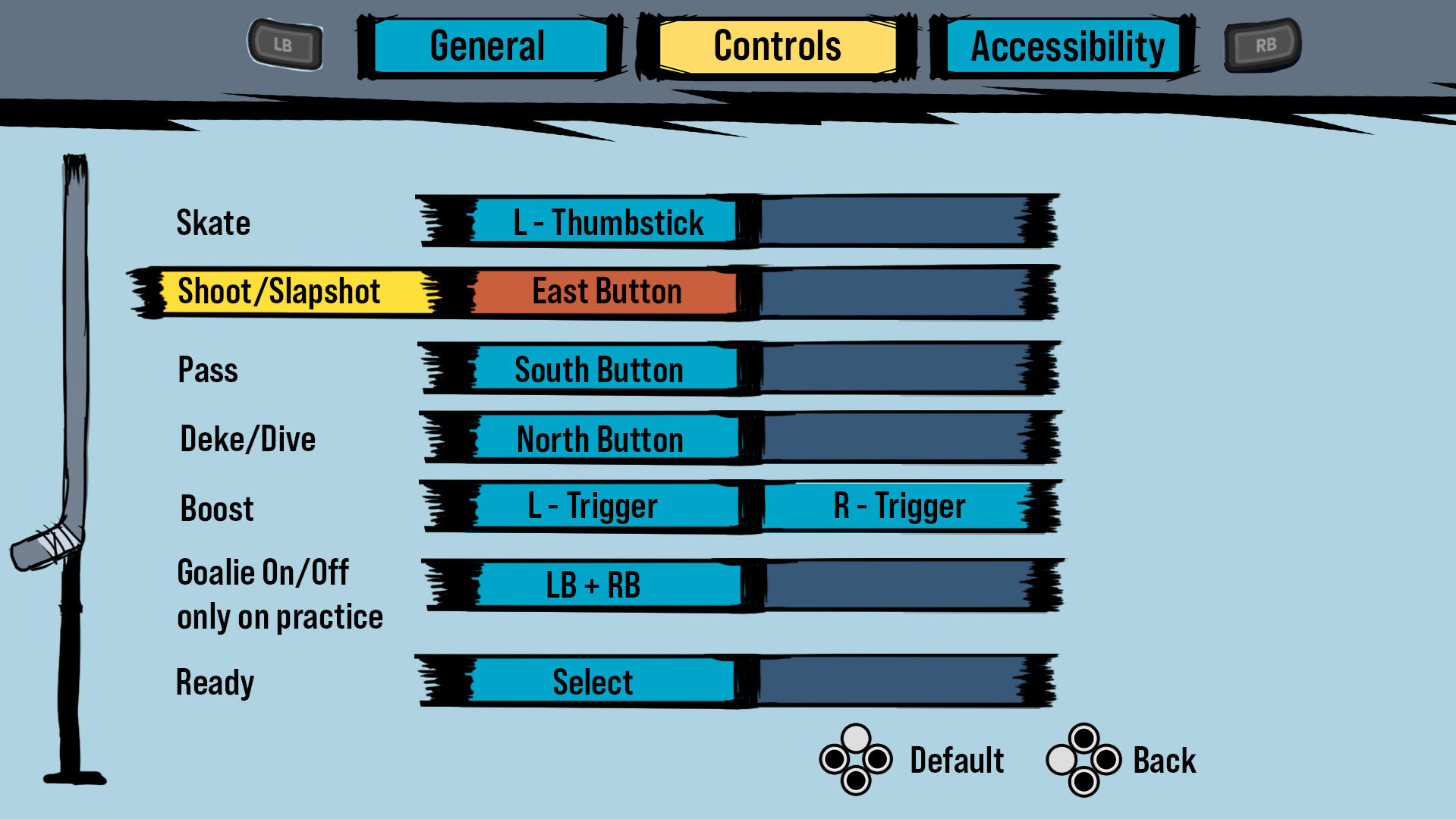
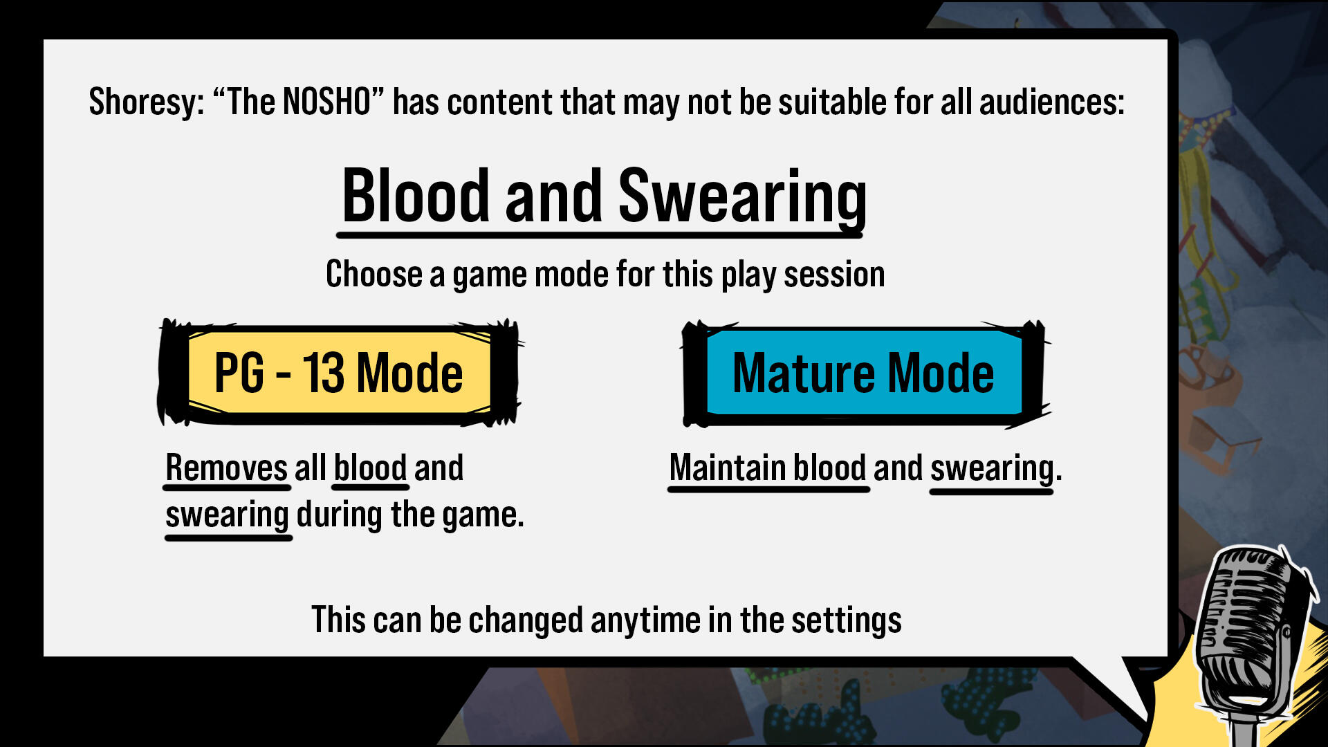
- Sensitive Topics: The ability to disable blood and goreRemapping the buttons, changing the text size, and removing blood and gore; could all be handled in the settings tab through a enable and disable. However, ensuring that players are aware of which character they play, especially in multiplayer mode, requires a feature.

The settings mock up for remapping the buttons in the game.

The mock up for the pop up when players boot up the game about the sensitive content in the game; the options can also be adjusted in the settings.
The game logo in black and white. There are multiple different types of colour blindness, but generally we want to have each colour be distinct by using a black and white test.
The game logo in regular colours.
Colour Blindness and the Game
Colour blindness is when a person see colours differently, and affects their ability to tell the difference between certain colours. There are multiple types of colour blindness and all of them affects gameplay that depend on colour to communicate information to players.In the game, colours is our primary tool for differentiating the players' and opponents' team, and who plays a character during multiplayer mode. This was going to be our main issue for this game, as people with colour blindness will have difficulty picking up the game due to our heavy dependence on colours.Due to our game having a multiplayer mode, changing the whole colour scheme of the game would be destructive for the players who do not have colour blindness, and would ruin the whole aesthetic of the game for the colour blind player who just have an issue with one colour that we used.In the game, the major features that use colours to convey information is the teams and the player icons. Players can choose what team they wish to play in Shinny mode, and the problem is solved through the multiple different team colours and the ability to play the home or away colours. However, the player icons is still an issue.
The Design
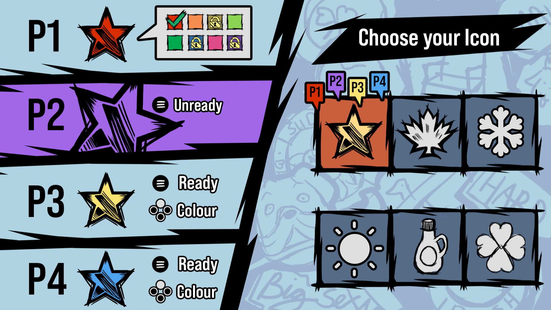
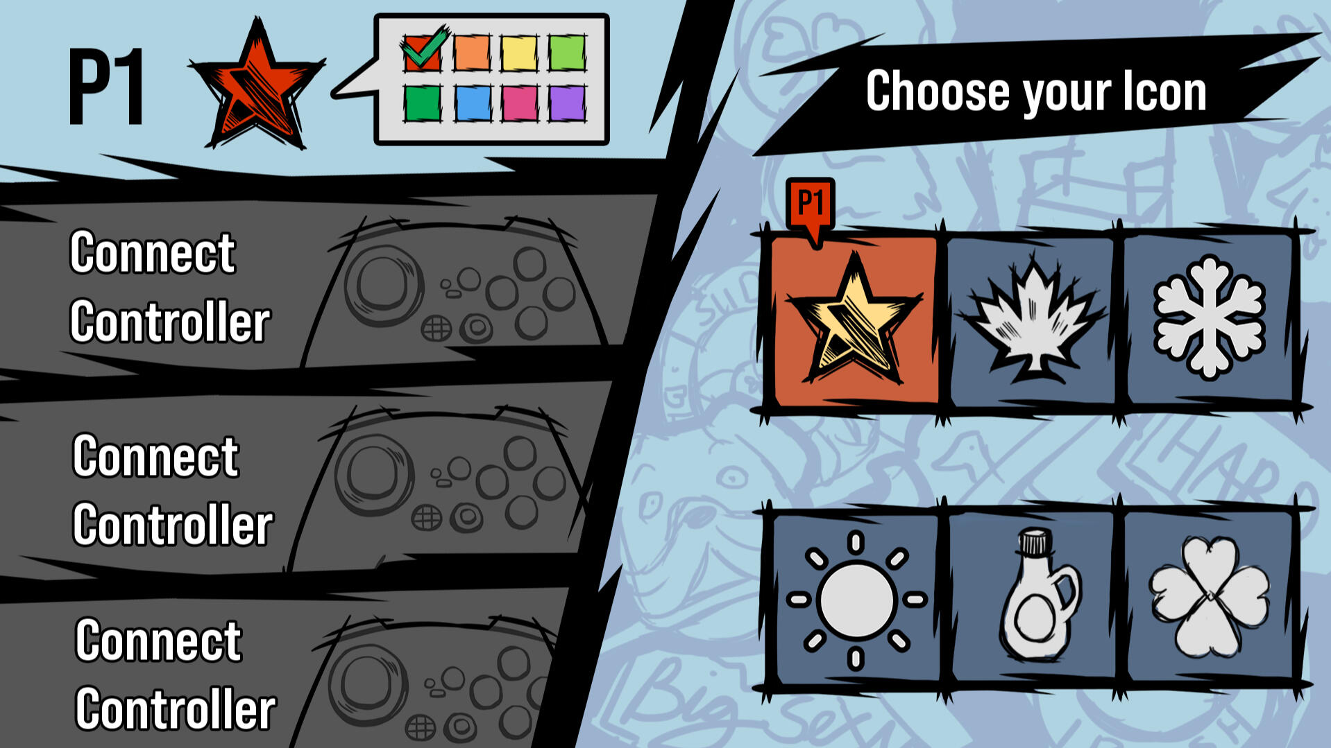
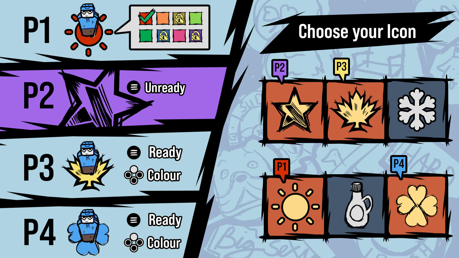
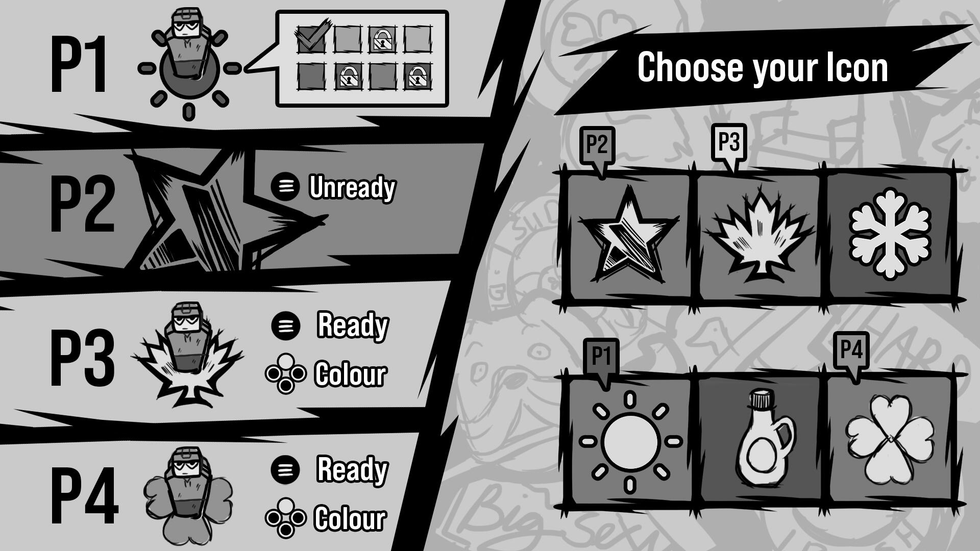
To ensure that all players, colour blind or not, can enjoy the game all at the same time; I designed a feature that allows players to choose what colour and icon they want their player to be.This screen can be accessed at the main menu, pause menu, and shinny mode flow; and it allows players to choose what icon they wish to play, and choose a colour -- so if multiple players choose to have the same icons, they can do so. Colour is locked to one player per colour, to avoid confusion during play.Players can change their icon whenever they wish during the game through the pause menu, and allows the opportunity for players to test out colours and icons to find which fits best for them.The mockups show on the left side: the list of players that connected, and their options. P1 is choosing a different colour, purple, yellow, and blue are locked due to other players using the colour; P2 is ready to play. Right Side: the available icons the players can choose and whichever they are using will be indicated on the bubble above the icon in their player identification.The icons are tintable -- allowing the image to change colours in the engine, and the player markers in game are flat images so changing icons is just a change of an image.

Mockup of the Player Icon Screen when all four players are connected.

Screen when only one player has connected
The Conclusion

Mockup update when players choose different icons and colours; added a player place in on top of the icons in the left to show how the icons look in gameplay.

The mock up in black and white. Colours blend with one another, but due to the change in icons, it is easy to read which player is the character controlling based on the unique icon indicator.
After learning more about accessibility and the process of designing a feature to remove the obstacles for players with colour blindness in the game, I start to realize that designing for accessibility is just designing a better game. There are so many players who use accessibility features without having the disability that the feature was designed to counter, because it is adds to the experience.The ability to choose the icon and colour the player gets to play helps people with colour blindness to differientiate who is who, but also allows players to create a personal connection with the icon and colour to form their favourite combination. Accessibility features allows more players to play the game, and also enjoy the benefits that come with it.
Chaos vs. Law | Individuality vs. Community
Our main vision for the game is to create an chaotic environment, and I thought of the dynamic of chaos and law: chaos is formed there is no law in the land and prioritizes selfishness of the person, while law is formed through community and the creation of boundaries. Chaos is individuality, and Law is about community. So we made a game where the players have the opportunity to create a community, or promote severe individuality.In my team, I was responsible for the game's design in the mechanics, core loop, levels, and interface.
Feeding Babies
Introduction to the game's core loop and main mechanics
Slapping Mechanic
Deep delve into the design of the slapping mechanic
Creating Chaos in Design
How chaos was used to guide the core and secondary mechanics
Level Design
Workflow of designing a level for a party game

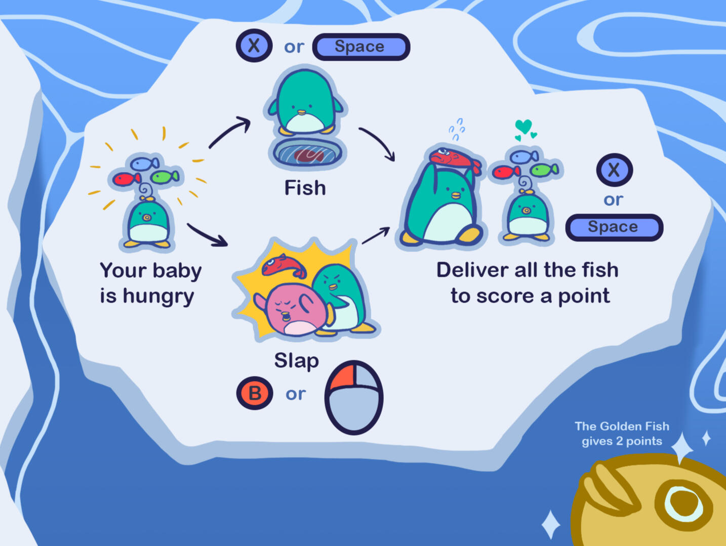
The tutorial of the game, detailing the core mechanics and loop. Players are given full control on how they want to get the fish for their baby

The alert system that is displayed on the left side of the screen. The alerts would first flash, to foreshadow that an event is happening soon, and the sign will stay on when the event is happening.

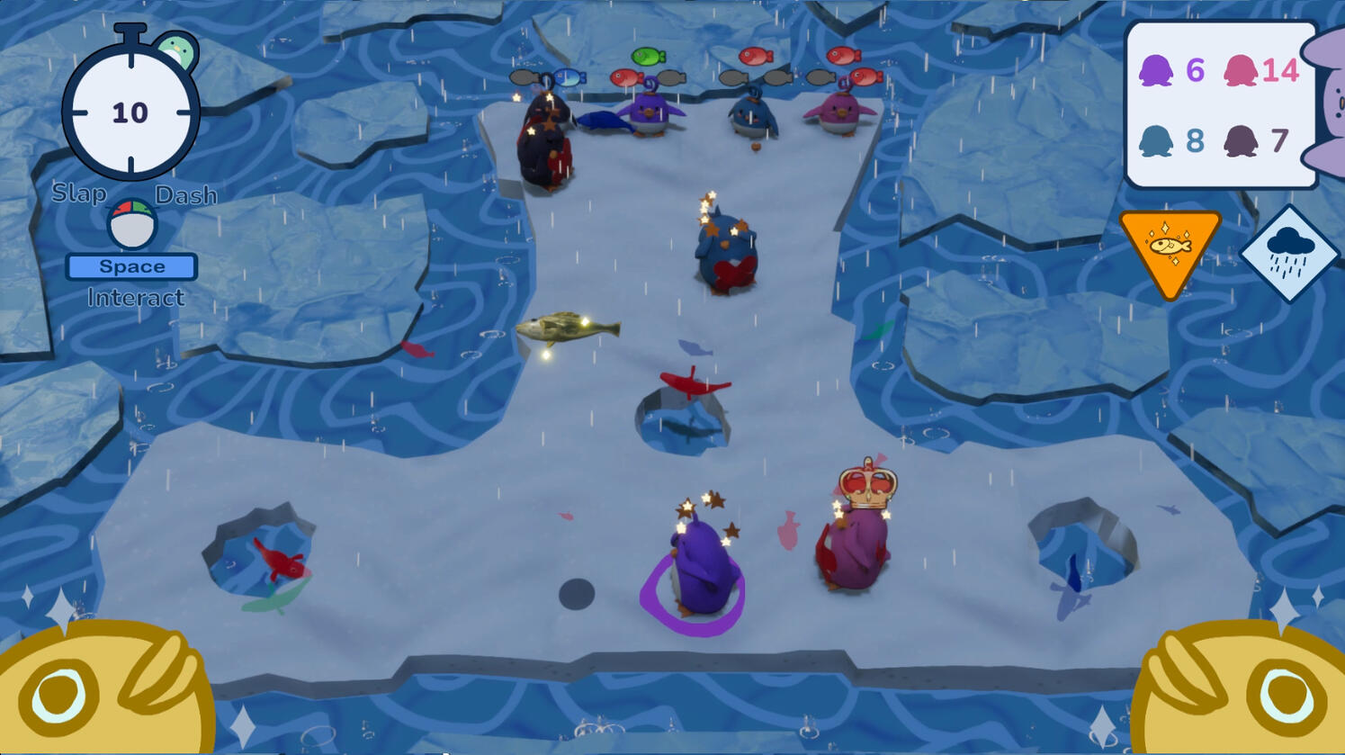
This is a sign from one of our secondary mechanics, the rain. The rain makes everything slippery and difficult to control, creating chaos in the movement of the players and their aiming

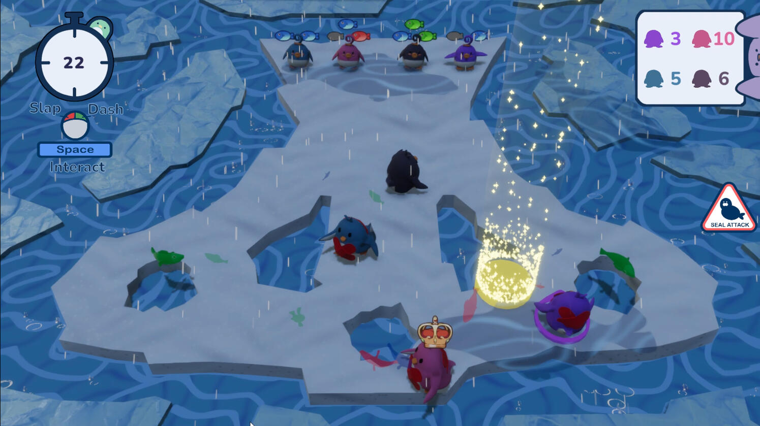
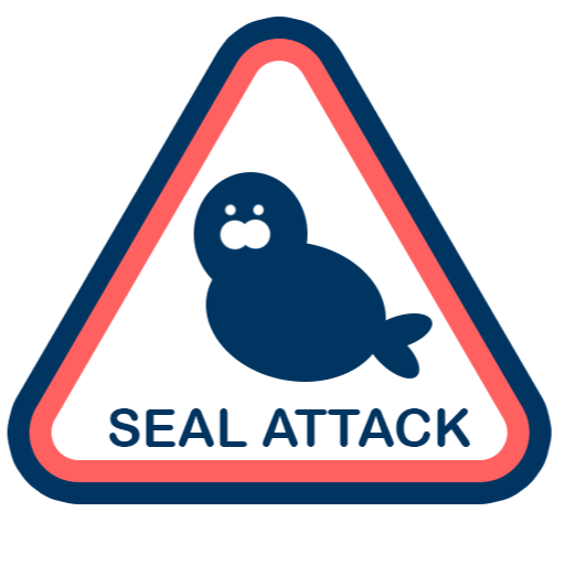
This is a sign from another of our secondary mechanics, the seal attack. The seal attack forces players, that are not in the safe zone, to drop their fish and be stunned; effecting the player's judgement for risk (being stunned) and reward (feeding baby).
Creating Chaos in Design
One of the best tips I have ever heard, from my teachers, was that chaos is about having too much things to do and not having enough time to do it. When players are forced upon to do a certain amount of actions, in an extremely limited timeframe; they feel a loss of control as they do not have the time to process their thoughts to make a decision. We create chaos through the overstimulation of the player, based on the events of the game.
Core Mechanics = Control
When designing the core mechanics, I wanted them to represent control; each core mechanic creates an expected reaction that the players can easily learn, and gives players full abilities to feed their babies to win the game. The core mechanics are designed so players feel that they are in command of their character at all times, so players can feel how the game is supposed to be when it is predictable; predictability is the opposite of chaos. However, it is important for players to experience the game, without the chaos, to allow them to identify what chaos is and when it happens in the game. A game that starts off chaotic, and continues to be chaotic, will be read by the players as the natural state and a part of the everyday. However, we delay our chaos to allow players to recognize the predictability and get comfortable in its embrace, so the shift in chaos becomes more significant.
Secondary Mechanics Creates Chaos
While the core mechanics establish control, we use the secondary mechanics to introduce chaos. We based the chaos from nature, as it is one of the most unpredictable element in the world; our secondary mechanics is nature. Nature is chaos, as our players can not control how the world acts towards them; this is emphasized as players can not control when the events happen and which fish is coming. We used the narrative of man(player) vs. nature (the game world), to display chaos.
Maneuvering through Chaos
However, there is a issue with chaos; the unpredictability can make the game feel unfair, and make the players feel like they are being tossed around rather than fighting nature. To combat this, we added an alert system in our gameplay UI; the alert system tells players when an event is about to happen and allows players to be aware of future events. The alert system gives the player some control of nature, like the weather news does to people; we can't control the weather, but we can control how we react to the weather. By letting players be aware of the events, players are faced with chaos but they can orient themselves to control how they behave during the events. Through this system of juxtaposing control (core mechanics) and chaos (secondary mechanics), players get to experience the chaos of fighting with nature.
Design of the Slap Mechanic
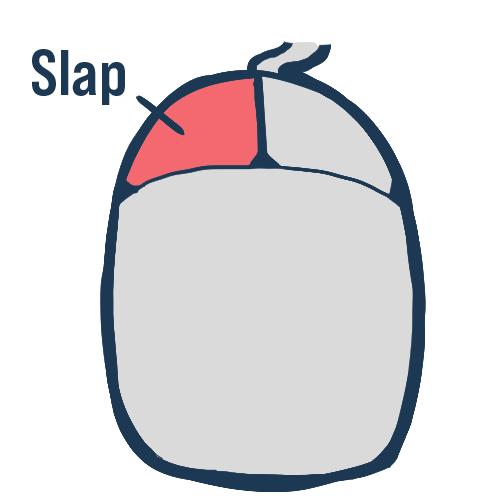
The slap mechanic was designed to allow players to enter conflict with another to drive chaos, as it is the only player controlled mechanic that directly opposes another player's penguin. When a player slaps another player's penguin, the victim penguin could drop their fish and enter a temporary state of disadvantage in the game.We wanted to make slapping easy, but fair to other players. We located the slap button in the most convenient location in the controls, so players can press it whenever they needed to: we attached the slap in the left mouse button and the east button in gamepad controls. Due to the ease of location, players slap more than any other button.
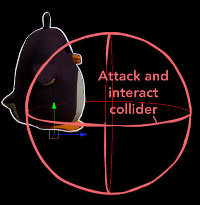
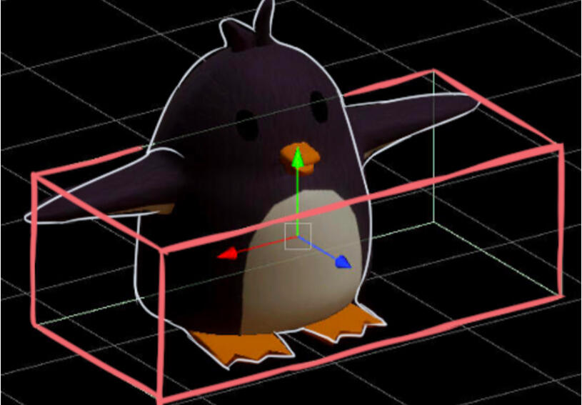
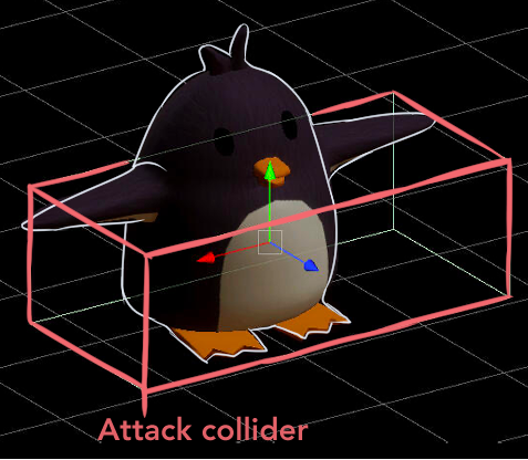
Screenshot of the penguin's attack and interact collider from the Unity Engine

We also made sure that the players receive instant feedback through the use of vfx, sound, and impact on the victim players; players who have been slapped once gain a red mark on their penguin. This was the only mechanic in the game that created more feedback visual feedback than any other mechanic in the game; due to the ease of action, and the large feedback reward that it give, players choose to slap more than to fish.
In order to slap another player, the attacker needs to come close to another player for; once the attacker's collider is near another player, the attacker can press attack to cue the animation and perform the action.
Penguins can slap with both hands and the slapping hands alternate to create a natural flow and look. Despite slapping with different hands, the attack collider is shared to give consistency and predictability in the attacks.
Design of the health system
Each player has 2 maximum hit points. To make slapping fair, the attacking players must successfully reduce their opponent's hit points to 0 in order put their opponent's penguin into a 'dizzy state'.Full HP (2 HP): players have all their mechanics.Half HP (1 HP): players have all their mechanics, but they gain a red band aid to indicate their health.No HP (0 HP) - Dizzy State: players drop their fish, if they are holding any; players can't slap or pick up anything ;and players can only move at half speed. This effect last for 5 seconds and after the time elapse, players will regain their full HP and their abilities again.We wanted to give players control at all times but have the slaps be rewarding to the attacker yet punishing to the victim. In order to do that we chose to let the victim only control the direction of movement giving them the ability to plan their revenge and make action towards it despite the temporary disadvantage.
The player who reduced another penguin's HP to 0, gains an advantage over the 'dizzy player' and can steal their fish, if they hold any.Through the ease of the action of slapping, and the added difficulty of slapping a penguin twice, for them to drop the fish; slapping becomes the most preferred method for players as it is intuitive and rewarding through its challenges.
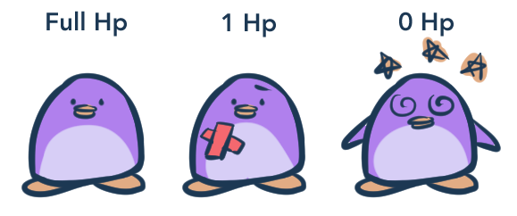
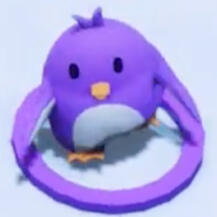
The penguin in their normal state and full hit points.
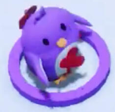
The penguin with 1 hit point remaining indicated by the bandaid on their body.
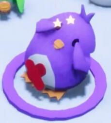
The penguin in the 'dizzy' state. Stars will appear above the penguin's head, and they will gain the status effects.
The Challenge: Network lag
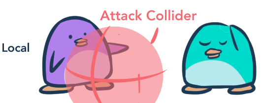
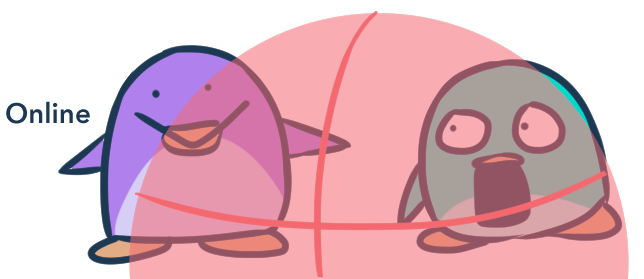
One of the difficulties we experienced in this mechanic was due to the networking system.When we play tested the mechanic on the same computer, the range of the slaps are accurate.
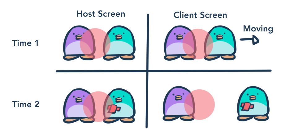
However, once we tested mechanic online, with different computers and internet speeds, the range of the slaps are severely increased.This is due to the nature of Host and Client in online games:1. The Host is responsible for holding the master copy of the gameplay information, and passing the data to the Clients.2. The Client would take the information and send an updated data to the Host; the Host would take the Client's information and merge it with their own to make a new master copy that is consistent to the Host's and Client's information.3. The Host will send the updated information back to the Client and the cycle repeats.
Networking bugs occur when the Host and Client are unable to pass their information fast enough. This means that there is a delay of events occurring in the game, and multiple players experiencing different things. In the case for Fishy Business:[Time 1]
Client's penguin (Teal) is moving out of range from the Host's penguin (Purple), but the Host sees that the Client's penguin is in range to slap. The Host will slap.[Time 2]
The Client moved away from the Host's collider, but still received the attack. This is because the Host still sees that the Client's penguin is in range.
Due to the Host holding the master information copy, the system will take the Host's information over the Client's, and this results in the larger collider range -- The Host reads that the Client's penguin is in range, and the system will obey the Host's information, as the Client sent their information too late.

The new attack collider taken from the Unity Engine
The Fix: Make the collider smaller!
Due to the networking bug, the collider is larger than expected. So to fix this, we separated the attack and interact collider, and made the attack collider severely smaller -- if networking made the collider range larger, then we made the physical collider range smaller to balance it out.The interact collider is still the same as before, while the attack collider only covers the wing's of the penguins. Having a tighter collider allows the networking bug to still happen, but it doesn't ruin the gameplay experience.
Level Design
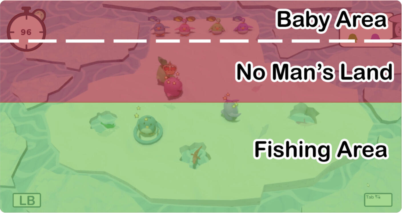
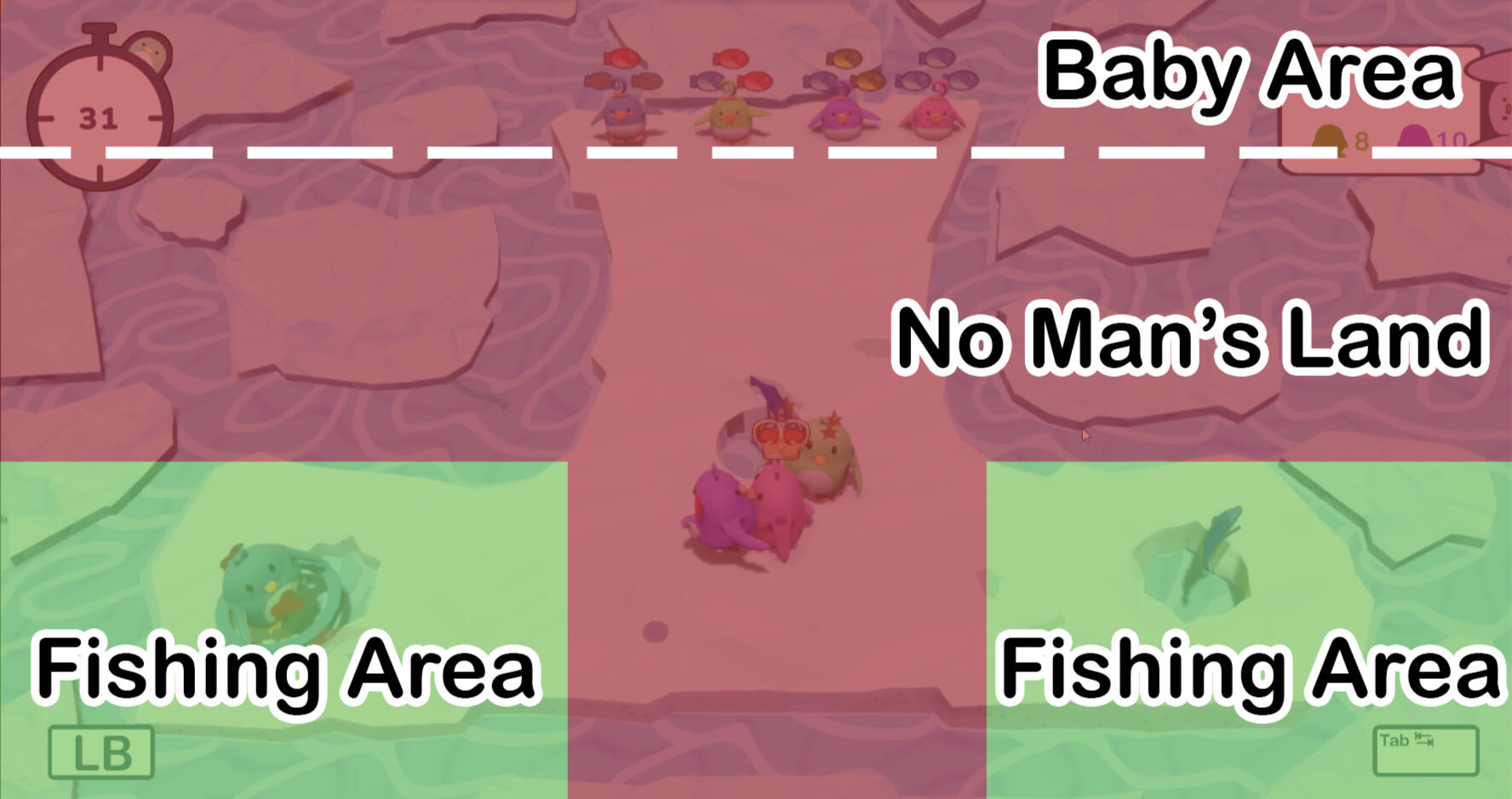
When I designed the levels of Fishy Business, I was inspired by children sports games that would be played during sports class or recess. I thought it would fit our game, as our target audience is people who enjoy party games; party games are enjoyed by people from different ages, and the best way to appeal to everyone is to give players an inherited shared experience. The inherited shared experience I chose to focus on is when we were kids and sports games.The main influences for our level structure was Capture the Flag. Capture the Flag required players to go past no man's land, and into enemy territory to achieve a point. I wanted players to experience a moment of uncertainty, by creating the No Man's land to be majority of the map; this was done by placing all the babies on one end of the map, and all the fishes on another. Through the polarization of the placement, players have to go to the fishing area (safe area) and go through the No Man's Land in order to go to the baby area.
Risk vs. Reward Based on the Map Region
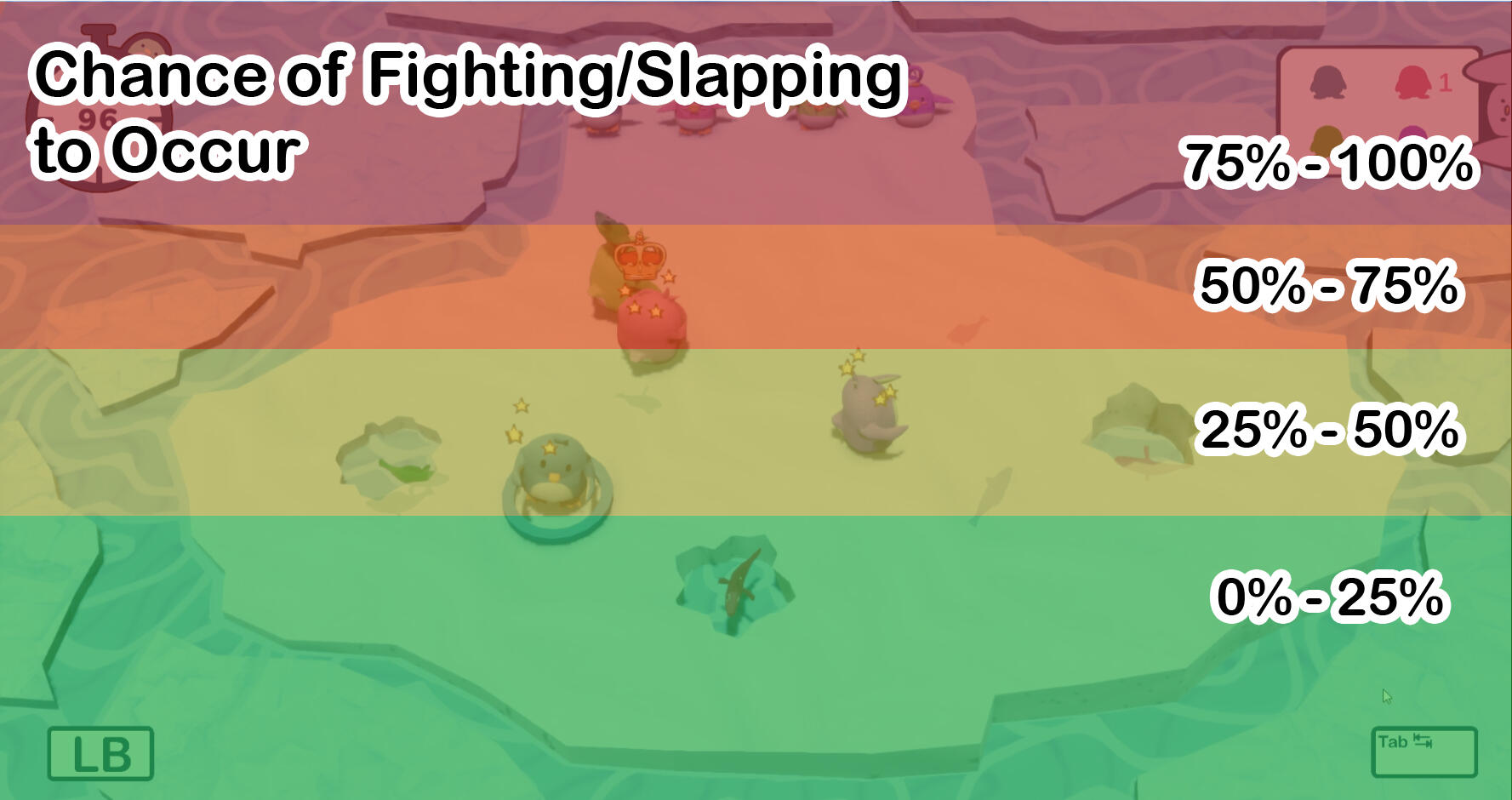
The fishing area is considered the safe area, as it is the area where players are less likely to attack another player, due to the distance from the baby zone and the abundance of fishes; players have more reasons to fish, rather than to fight in the area due to the fish population. However, as players go closer to the baby area the fish population in the area drops significantly; the closer the players are to the baby area, the more fights happen, as the only fishes that are available for taking are from other players. This evokes risks (not getting the fishes that the player needs faster than the other players) vs. reward (getting fish by stealing from others and reducing the travel time to the baby).
The Potentials of Camping
A concern arise from our teachers about camping; due to the all babies being aligned together, players would wait by the baby area and steal oncoming players. This was a valid concern, as it creates a saddle point in the level design. However, during playtests, players who decide to camp do not become the winner of the game; this is because players are able to take steal fishes from others easily.
Core Mechanic Prevents Camping
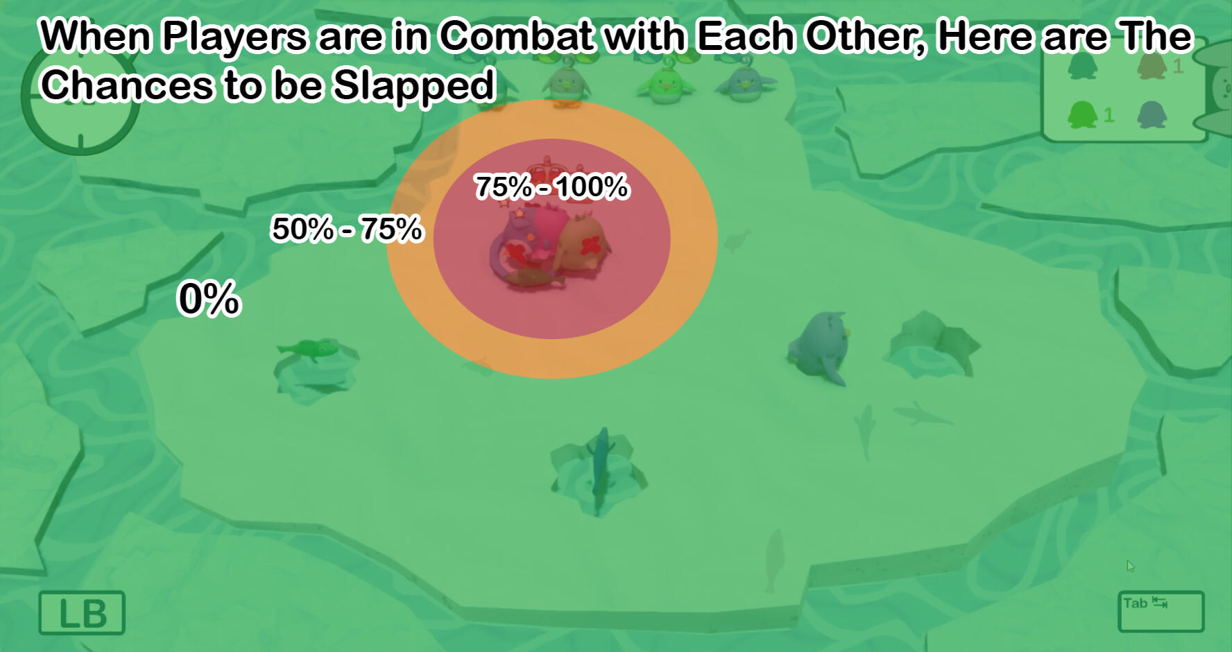
When a player got slapped twice and their fish stolen, they enter a slugged state; the slugged state do not prevent them from moving. Due to this ability to move, players can still catch up to the player that attacked them and get back easily revenge, as it is easy to steal fish from others. This creates a back and forth between multiple players, and the difficulty to feed babies become severely more difficult as players has to fight and make sure they feed the right baby in the small area. During these fights, the non-combatant players gain temporary safety due to half of the players being distracted with each other; the non-combatant player can enter the battle if they wish to and raise the difficulty of gaining the fish, and raising the temporary safety to the only non-combatant player. When players fight amongst each other, the risk vs. reward rose in each combatant as they weight in the time they also spend in fighting for the fish. While the player who are not in combat have a lower risk and higher reward, by being unaffiliated with the fight, as their chances of being attacked is severely reduced to combatant players being distracted with each other.

This is the first level of the game, where the fishing area is half of the No Man's Land, to allow players to adjust to the controls. The baby area is included as a part of No Man's Land, as players can steal fish until the fish has been directly fed

This is the last level of our game, where the fishing area is less than No Man's Land, due to the single pathway and narrow walkway

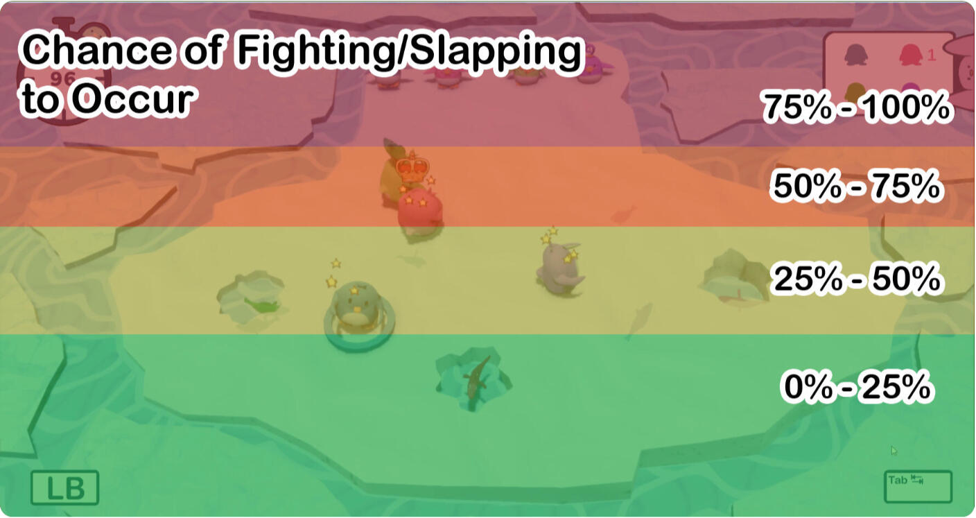
This is the chances of fighting/slapping to occur in the first level of the game; the closer the players are to the babies, the higher the chances of fighting/slapping to occur due to the proximity

This is how the Chances of Fighting/Slapping changes when there is a fight that is happening. The players who are in combat with each other have a higher chance, compared to non-combatant player.
Design of the Mechanics
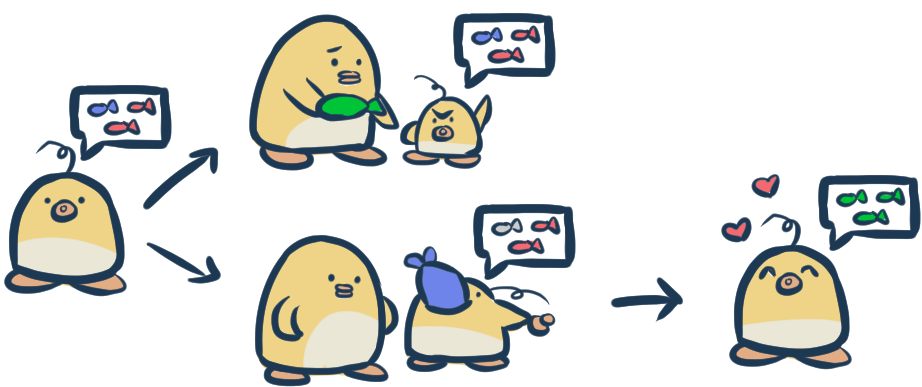
In Fishy Business, players play as Parent Penguins who must be the one to feed their baby the most, before the time runs out. Each baby comes with a set of orders, indicating their desired fish. Once an order is complete, the baby will give the player a point and ask for another different set of fishes. The babies have three states:1. waiting for fish
2. reject fish
3. eat fish
4. new orderThere are three kinds of fish: red, blue, and green. Due to the population of fishes and the babies' demands, multiple babies will ask for the same fish as another baby.


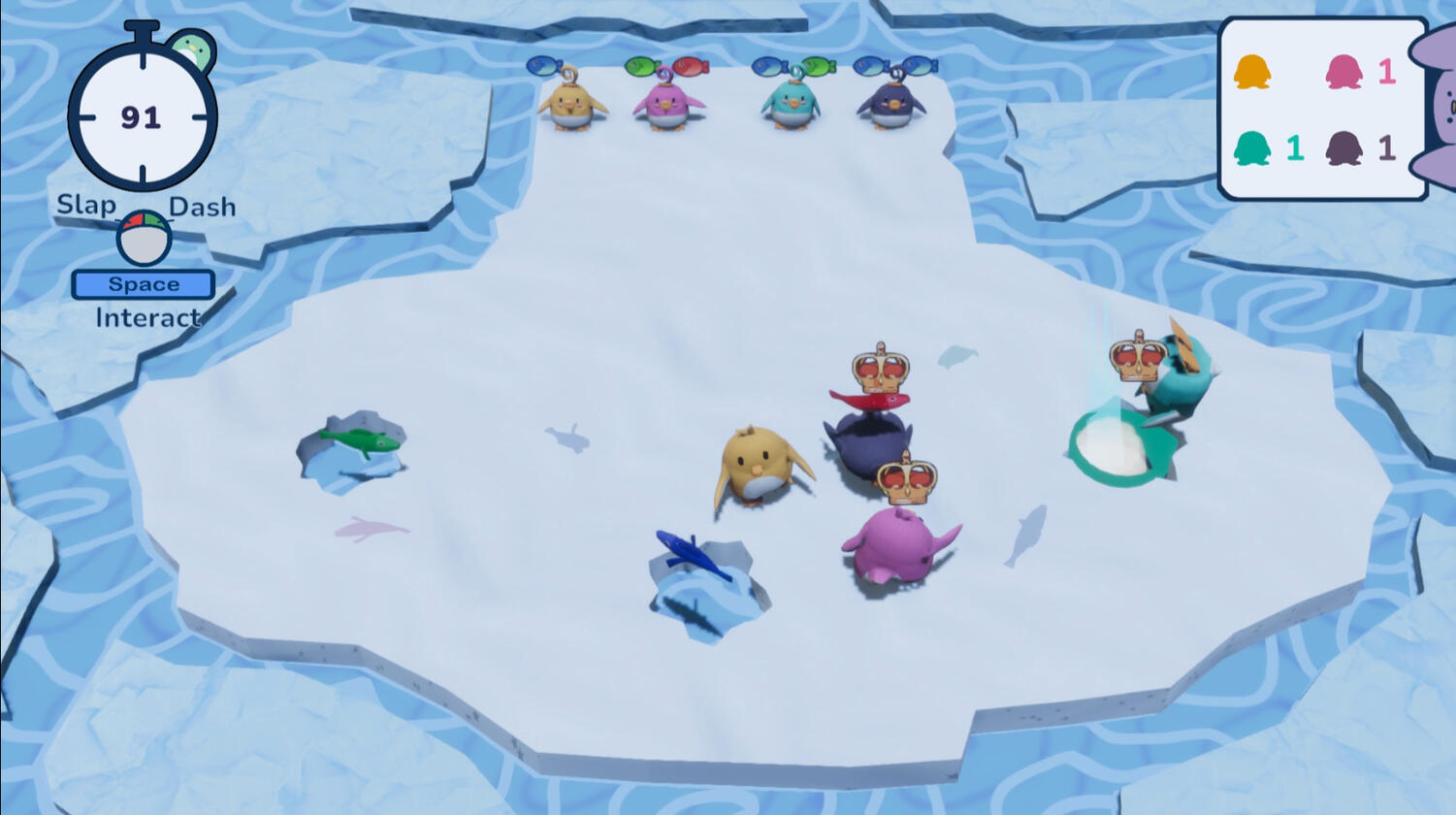
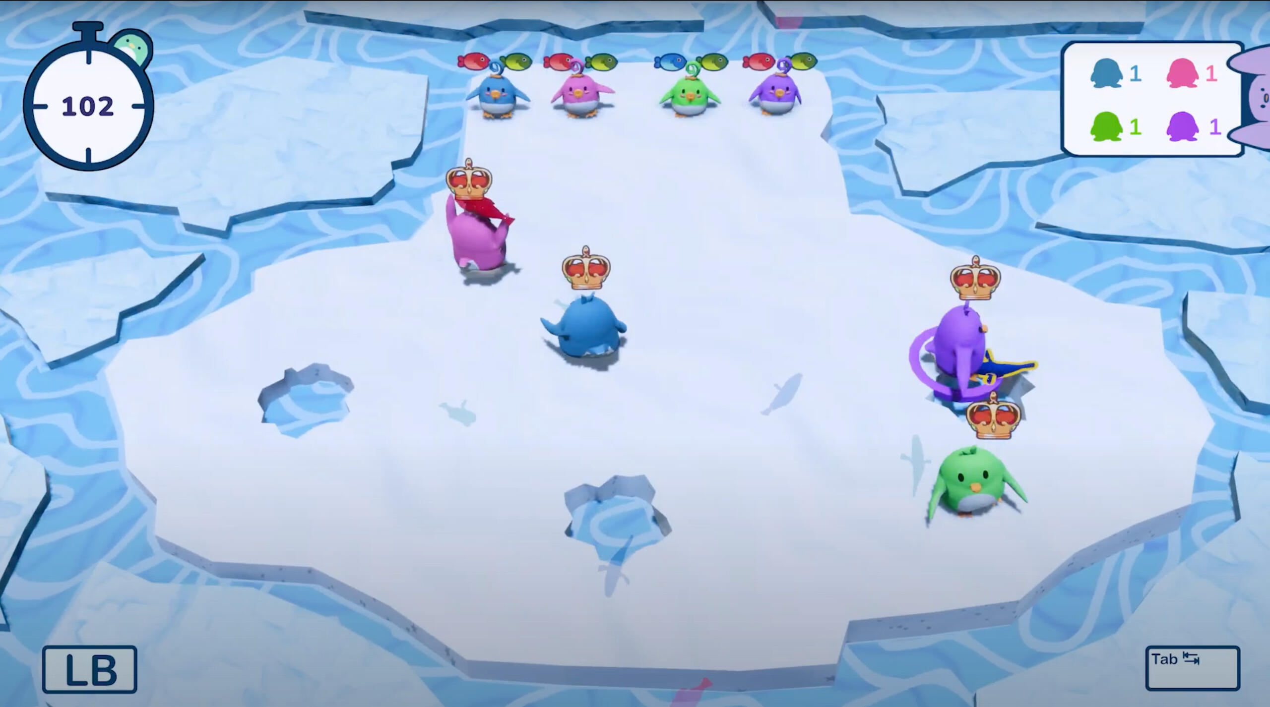
Screenshot of the game showing where the locations of the players, babies, and fishing holes are.
Standard map layout
All the babies are positioned together on one side, to ensure an equal opportunity for all players to feed the babies.Fishing holes are positioned on the other side of the map. Due to the map's structure, stealing and slapping becomes more preferable than fishing for the desired fish.By concentrating all the babies and fishes in one area, this promotes conflict at all parts of the level. The players will have to bump against one another to gain what they want and drive chaos in the period.
The Challenge: too much fighting near the babies
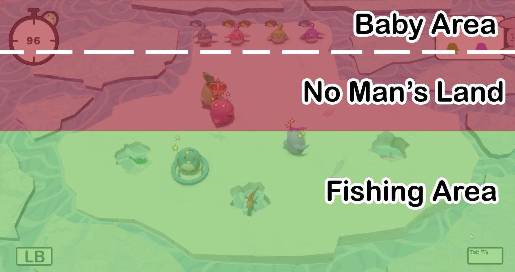
One of the challenges we faced was that due to the map structure, fighting becomes more prevalent the closer the players are to the babies. The closer to the babies when the fish are lost, the more difficult it becomes to get the fish back from the thieving player.The map is segmented into 3 parts:
1. Baby Area: Low on fish. Babies are fed here and fighting extends to here.
2. No Man's Land: Medium on fish. Majority of fighting happens here
3. Fishing Area: High on fish. Fighting is less likely to happen hereDue to the polarization of the babies and fishing hole locations, some players find it more advantageous to wait for one player to fish and steal it from them when they are close by. This will trigger a fight where the robbed player would find difficulty recovering. If all players choose this playstyle, the game would stagger, as no one would be courageous to fish.

Screenshot of the game with the different segment marked: baby area, no man's land, and fishing area.
The Fix: let them fight it out
The UI for "The Moving Babies" being called in the game.

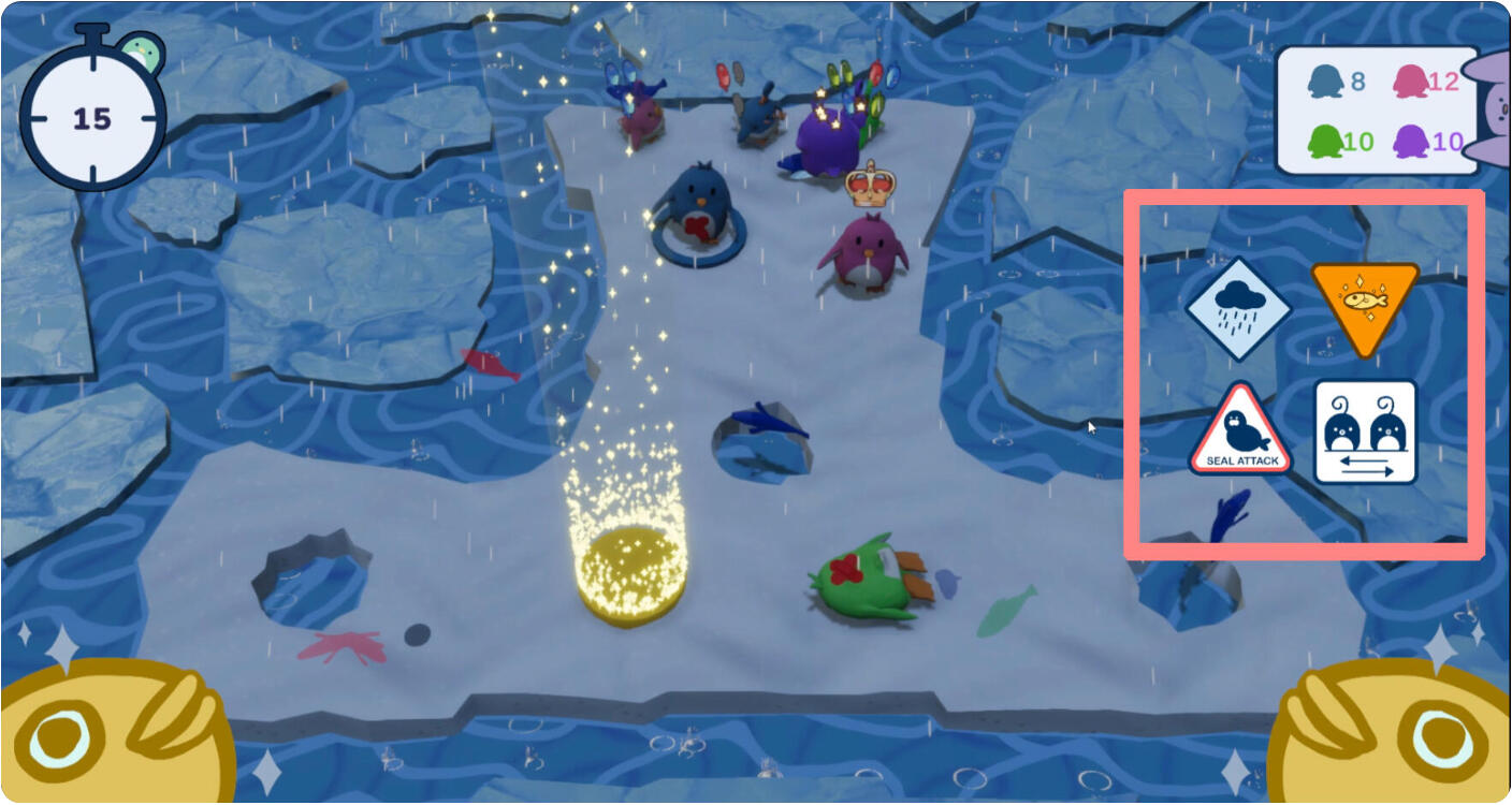
The UI warnings in the game, indicated in the right side of the screen.
To resolve this issue, we embraced the chaos of fighting by adding a bit of difficulty on the thieving player. The game's main pillar is the chaos, and we strove to make the feature more frantic rather than controlled.We added a gameplay event called "The Moving Babies" that causes the babies to change positions with another baby at any point of the game. A UI of the "Moving Babies" will appear in game when this happens, and inform the players of the change in baby position.If the thieving player do not pay attention to the baby's change of positions, they might feed a baby that isn't theirs. Due to the adjustment, the thieving player will have a moment of hesitance in trying to find their baby; this allows the robbed player to retrieve back their fish.Alternatively, the thieving player may accidentally feed another player's baby. The robbed player may not have gotten back their fish, but they can enjoy watching the thieving player lose the fish due to hubris.
Let's Make it a Party!
Graffiti Wars was my first long term project in Vancouver Film school, and my team wanted to make a party game as developing a party is very foreign to our team. This game prompted my final project, Fishy Business, and supported my learning in designing games outside of my comfort zone.In my team, I was responsible for the game design and the UI/UX. My goal was to understand how to design a game where players work together and how visuals communicated can be used to communicate to players.
Creating Dependency in the Core Loop
Designing the core loop of a co-op game
Colour Language
How colours can be used to communicate with players during gameplay
Creating Dependency in the Core Loop
Graffiti Wars has two roles that the player can choose to become: a painter or a cleaner. Painters are the main generator of gaining points in the game, while Cleaners prevent the other teams from gaining points; each team is assigned one Painter and one Cleaner. Due to the team based nature of the game, both roles needed to be distinct and depend on each other's action to win the game.
Limit the Available Points that the Teams can Gather
We made sure that players needed to depend on each other by introducing a limited amount of points that can be generated; a point can only be claimed by one team, unless it was to be taken down by an opposing cleaner. Through the introduction of the limited available points, players are incentivized to keep on top of their tasks and promote their team mate to do their assigned task: painters are incentivized to encourage their cleaners to clean the marked walls, so the painter can mark the walls in their team's colours; and the cleaner are incentivized to encourage their painter to paint the walls by cleaning up the opposing team's colours and freeing up the available points that can be obtained. When the player's tasks depend on each other, players enter a cycle where they are encouraging each other to do their assigned roles and creating a community that depend on each other.We also made sure that the game can not be won without each other, as the available points are an even number and painters have the same speed of painting as the opposing team; if the players do not work with each other, all the points will be divided equally to result in a tie. To successfully win the game, players are tested in their ability to work with each other and how well they performed.
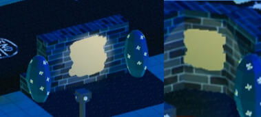
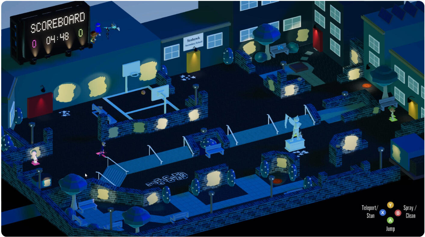
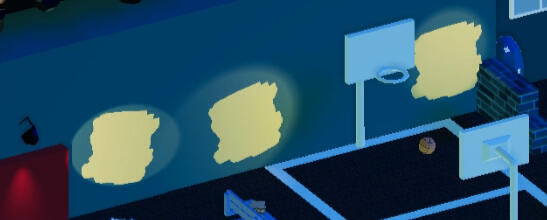
Available walls for players to spray on and gain a point
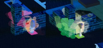
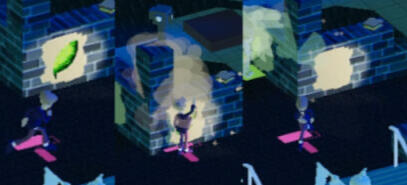
Painters spraying the walls to gain a point for their respective team
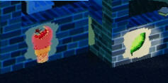
Walls that are marked by the respective team (Right: Pink team, Left: Green team), giving a point for the pink and green team based on which wall that has their colour
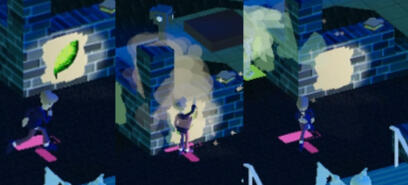
Pink team Cleaner cleaning the Green team's marked wall, and removing the point from the green team

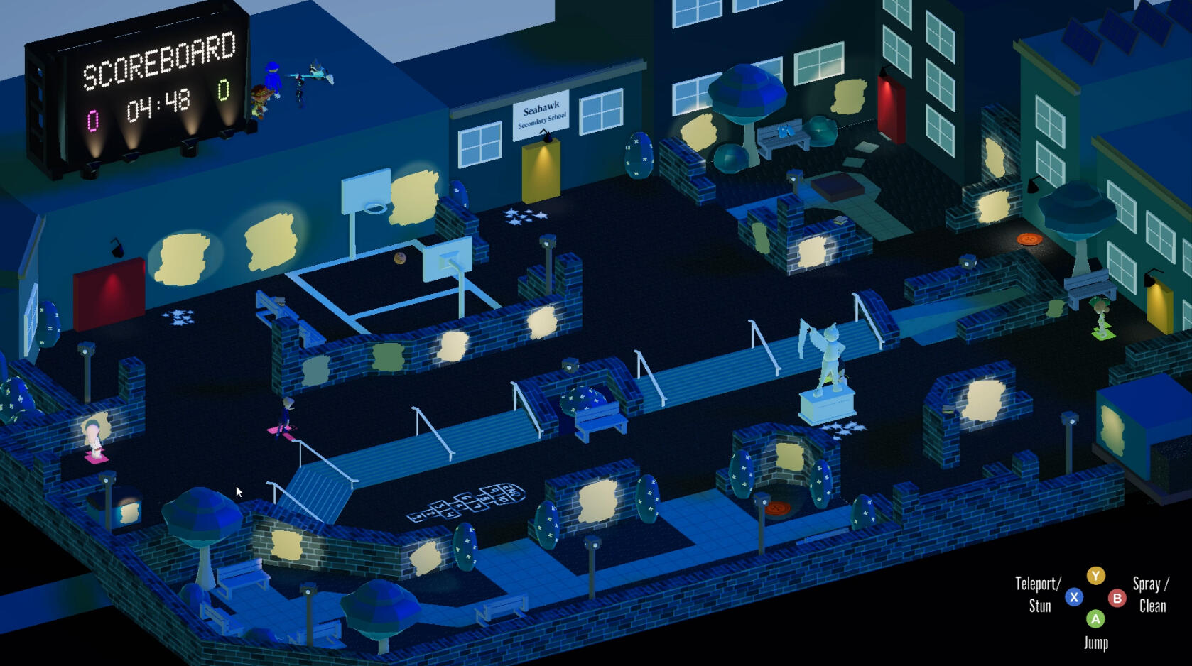
Overall map with the environment being cold colours, and the interactable with warm colours

Walls where players can spray are indicated with a light yellow and bright spot light to navigate the players eyes to it

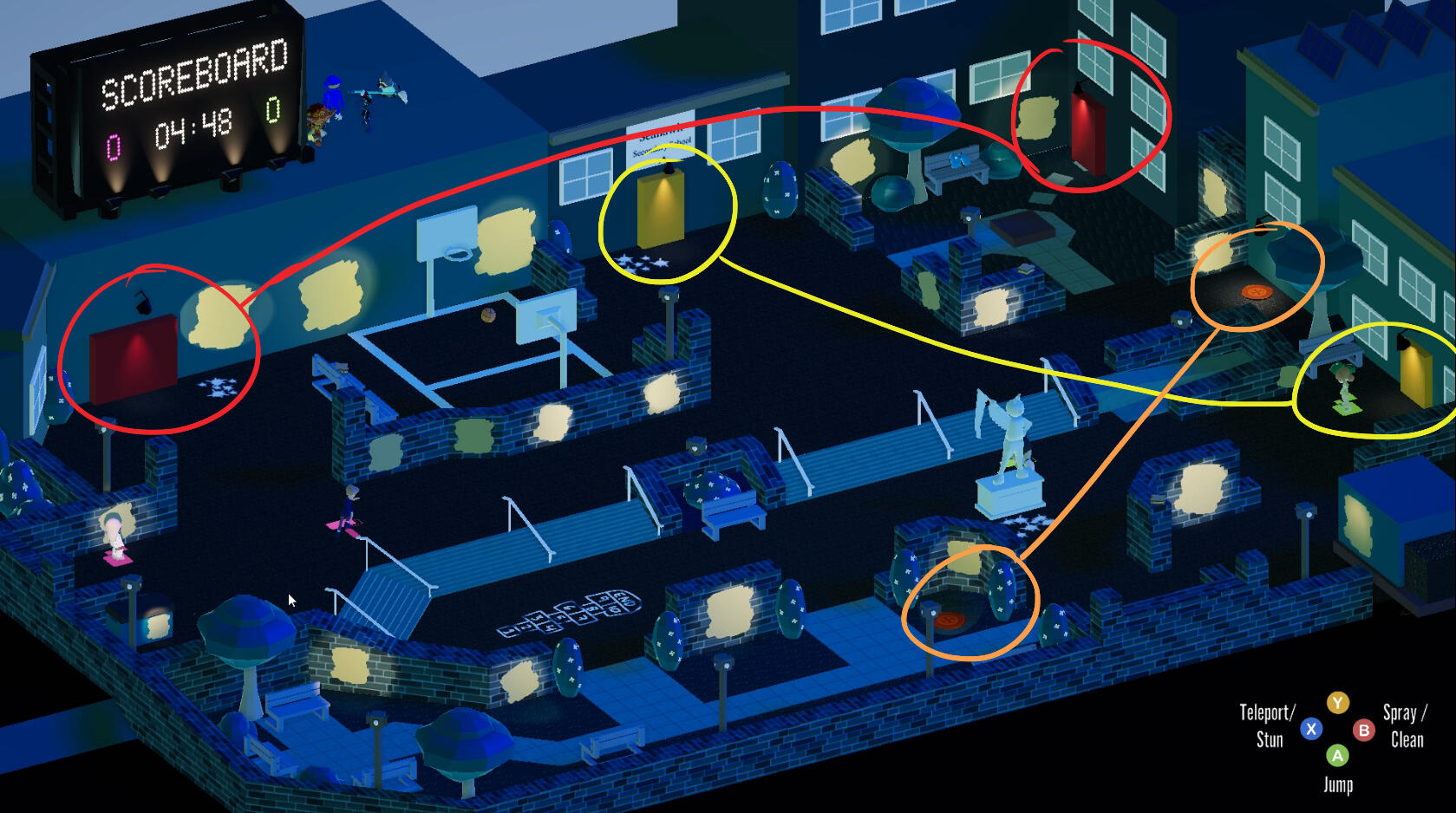
Teleport stations have matching colours to indicate their relation and intractability.
Colour Language
The colours of the game are dictated by their based on the interaction of the players. The blue colours, such as the environment of the world, are non-interactable objects in the world; players can not affect anything that is blue and the blue can not affect them. Warm colours, such as the marked walls and the teleport areas, are the objects that players can interact with. We chose red, yellow, and orange to identify their relations between the other interactable, as the objects that have the same colours are connected to each other due to that they are teleport stations.
Contrast to Guide the Eye
We chose colours that juxtapose each other, to create player focus on the interactable. The first priority of interactable are the walls: we made the walls light yellow so the eyes focusses on the walls first; the value of the interactable are pushed through a spotlight that creates a further contrast with the dark environment. The next priority of interactable are the teleport stations, as they are ways for painters to avoid cleaners; we linked the teleport stations with an assigned colour, so players can determine which door will lead them to a specific area.By allowing the map to be mostly blue, players can focus on the contrasted objects, such as the walls and the doors, so players can differentiate which thing can cause a reaction or not.
Coming Soon
Aim Trainer + Dating Sim
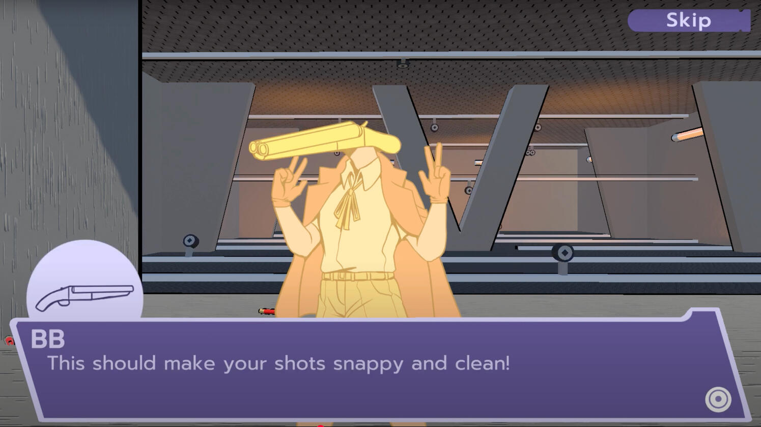
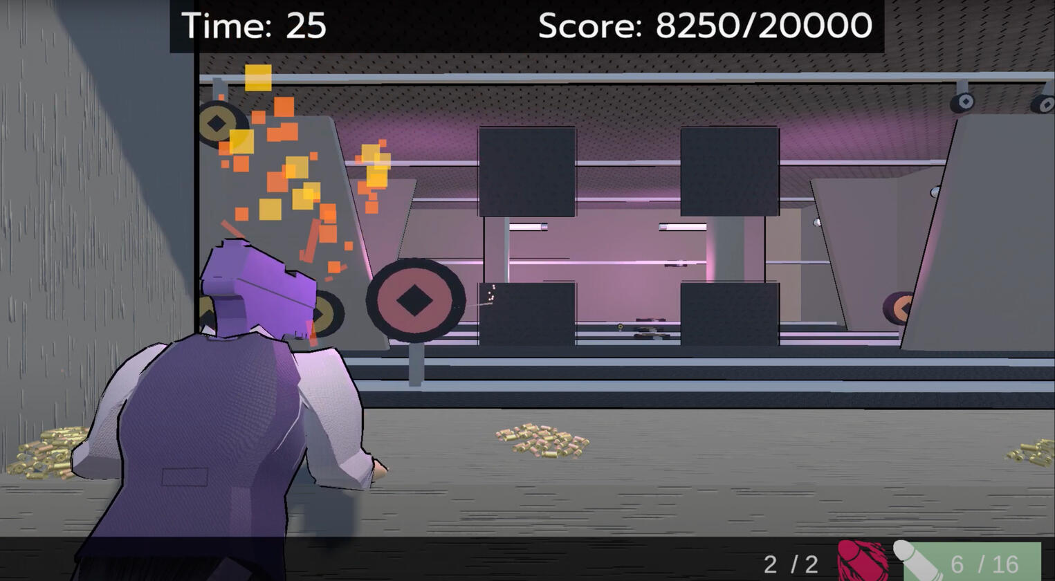
Heart of the Arsenal was a game jam that I participated in, with my classmates, during Vancouver Film School. Our goal was to make an aim trainer game where you get to date guns -- the success of the interaction is based, not on choices, but on how the good player shoots.I was responsible for the narrative design and character design in my team. This game jam was a joy to be in as I always wanted to make a dating sim that is not just about romancing the love interest.
Narrative Design
Narrative design process of an aim-trainer dating sim
Character Design
Designing the gun head characters and incorporating gameplay mechanics to the aesthetic

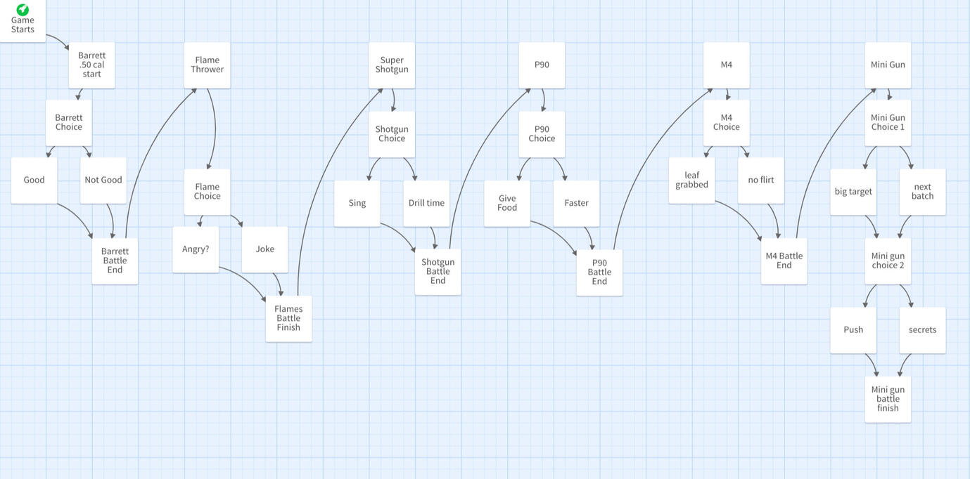
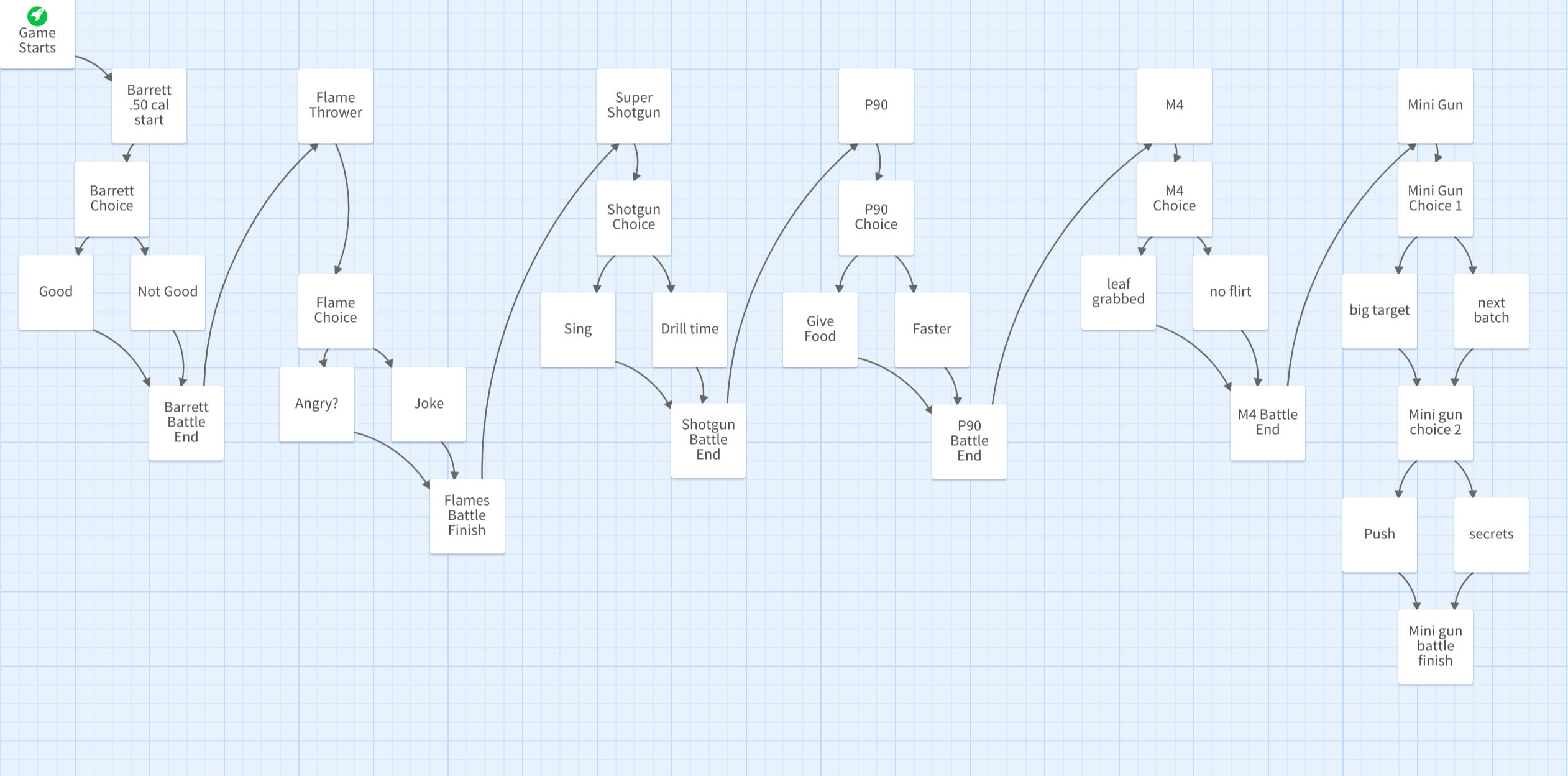
The narrative was written in Twine, a software for creating choice based narratives; I made the flow of the overall game to be more linear, due to the time constraints

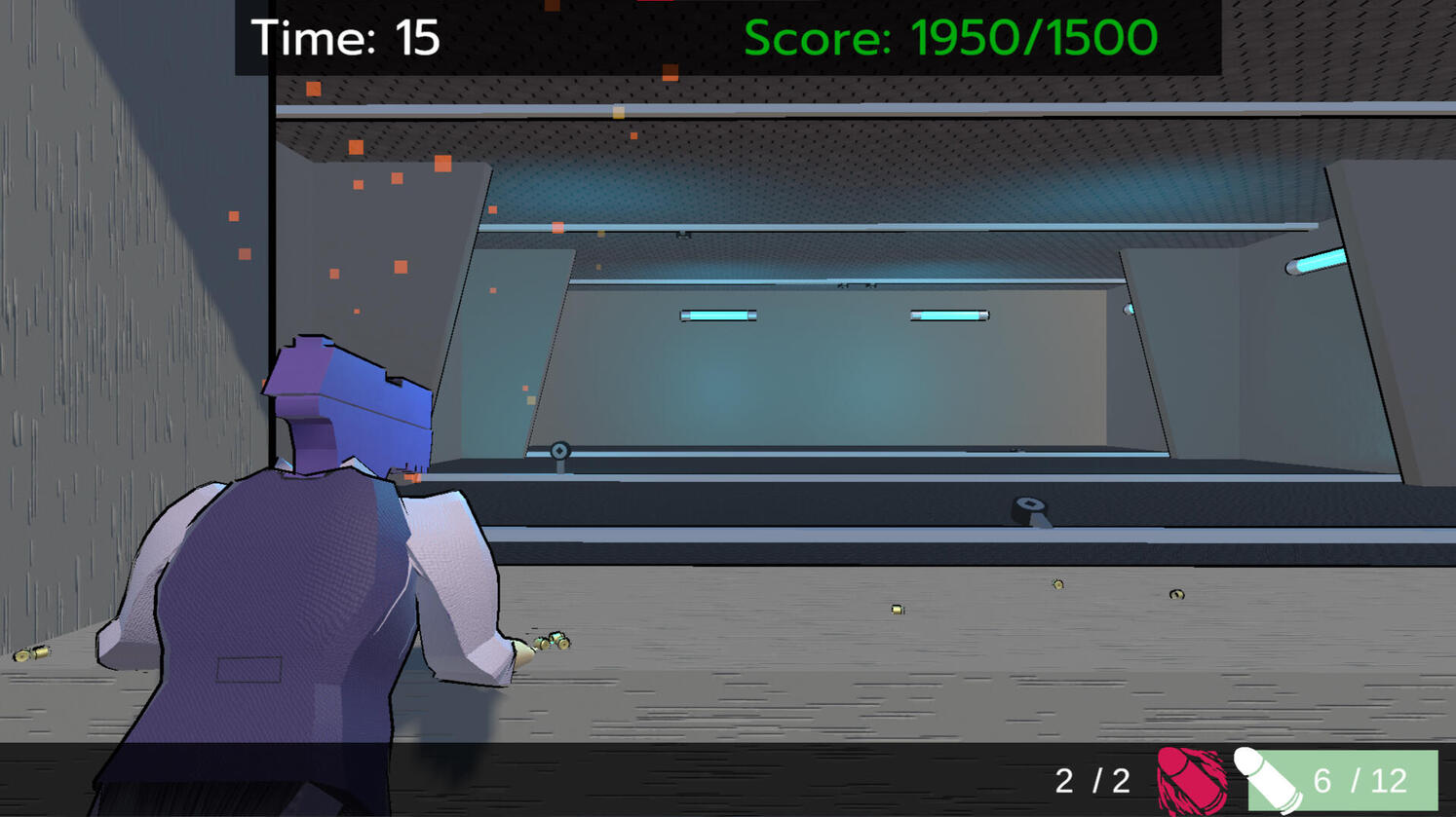
Half of the game is an aim-trainer, so I had to tie the reason why the player is in a shooting range into the narrative by making the drill a part of a test to impress the other guns

The other half of the game is a dating sim, so I made the choices of the players affect the difficulty of the drill. If a player were to answer incorrectly, the drill would be harder to complete due to the speed of the targets and appearance of target
Designing the Narrative of an aim-trainer
dating sim
This was one of the hardest thing I had to do during this Game Jam; writing a narrative that included 7 characters, within a time limit of 2-3 days. I had experience writing dating sims and script writing, but I had at least two weeks to compete the task. Due to the time constraint, I had to work efficiently to complete the story in time.
Connecting the Two Genres Together
The first thing I had to focus on is how both genres can harmonize with each other; what is the reason that the player is winning the hearts of other guns through shooting. I proceed to think about shooting as a way of impressing and seducing; the player is using shooting to demonstrate their skills as someone that is worth their time. One of the biggest downfalls in dating sims is that the player tends to be just a regular person, with barely any attractive qualities, and yet managed to woo a harem. I didn't want that in our game, as it did not make sense, so I made it that the player is attractive to the other guns because of his skills in shooting; that means the more successful the player is in the shooting range, the more attractive the player becomes to other guns. The goal of the player becomes to shoot and impress the other guns, so they can proceed to the next level; the goal of the player character is to impress the other guns, so they can become part of their group; and the goal of the other guns is to test the player character to see how competent they are, then slowly fall in love with the skills of the player and player character.In making sure that the goals of the player, player character, and other guns to be clear; I was ensured that the general story made sense before going into the details.
Integrating Choices in the Time Constraint
However, a dating sim is nothing without its choices. Normally, dating sim uses choices to gather approval from the romance interest, so they can progress with their route. Due to the time constraints, a divergent choice game would be unsuccessful as I would be unable to add depth to each route. In order to keep the choice aspect of the game, I made it that players must make a choice in the middle of the drill, to determine the difficulty of the aim-trainer. When a player answers "wrong," the drill would become more difficult through the speed of the targets or the time of its appearance. Through adding a choice, players are able to learn more about the characters they are impressing and see how their actions directly influence the game.
Character Design of the Guns - P250
(player character)
P250 was the first character I made for the game, as it was the character that needed the most time to create due to his frequent appearance and correlation with the player. When I first started, I went to research what the P250 is and it's performance. In my search, the P250 was a customizable gun that had great accuracy, was affordable, and easy to use. I took the details of the gun, and made it personalities for the main character: a friendly gun (affordable and easy to use), that has low self-confidence (the customizability became a double edge sword as they don't know who they are). Throughout the game, the player character learns to gain his self-confidence, through the trials as the trials give him upgrades; and the other guns motivate the player character out of the low self-confidence as they gave a part of them to him.
Designing Function
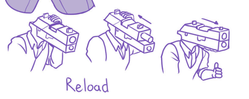
One of the challenges I faced in creating P250, is his reloading: the character has a gun head, and shoots from his head. Due to the anatomy of the character, he needs to shoot like a gun. I looked at videos on how the P250 shoots and reloads, to make sure that the anatomy of the P250 is accurate, and makes sense for the evolution of the characters. The P250 shoots with little recoil, so there would be no character design adjustments on the shooting. However, the reloading requires ammo to be inserted and the top part of the gun to be pulled back to define that the gun has been reloaded. I thought that the ammo are food for the characters, so the bullets would come from their throats or stomach; the pull of the top part would be initiated by the hand, like a traditional P250. The players would be able to see how the character reloads and added another dimension to the characters in the game.

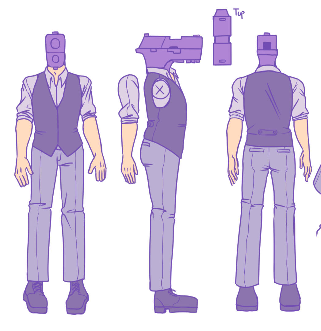
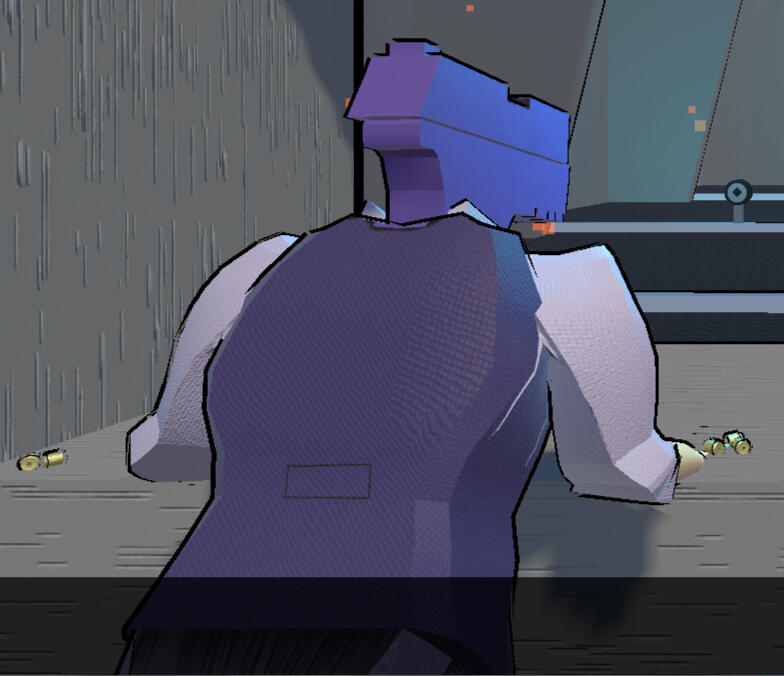
P250, the player character, was the only character I had to do a turnaround sheet due to his appearance in the game to be 3D. I knew that the 3D artist would not have enough time to model him, so I thought of making his design fit the low poly constraints

P250 3D render done by Josh Anaya-Paiero.

One of the most important thing in the game is shooting, and all characters have gun heads, so I spent some time researching how the gun would reload to fit their anatomy
BIO
Giovanna is an Indonesian-Canadian creator, based in Vancouver. She grew up playing a wide array of games, from small titles, like Wattam; and large titles, like Dragon Age. Giovanna graduated from Emily Carr University of Art + Design in 2022, with a Bachelor of Media for 2D-Experimental Animation with honours: President's award, Anti - Racism award, and Best Direction award. In 2023, she graduated from Vancouver Film School for Game Design, specializing in game design and level design. Her goal is to make games that is a culmination of her favorite genres.
© Giovanna Gowmez
Art of Giovanna Gowmez
Inferno
Solo Game Project | October 2023
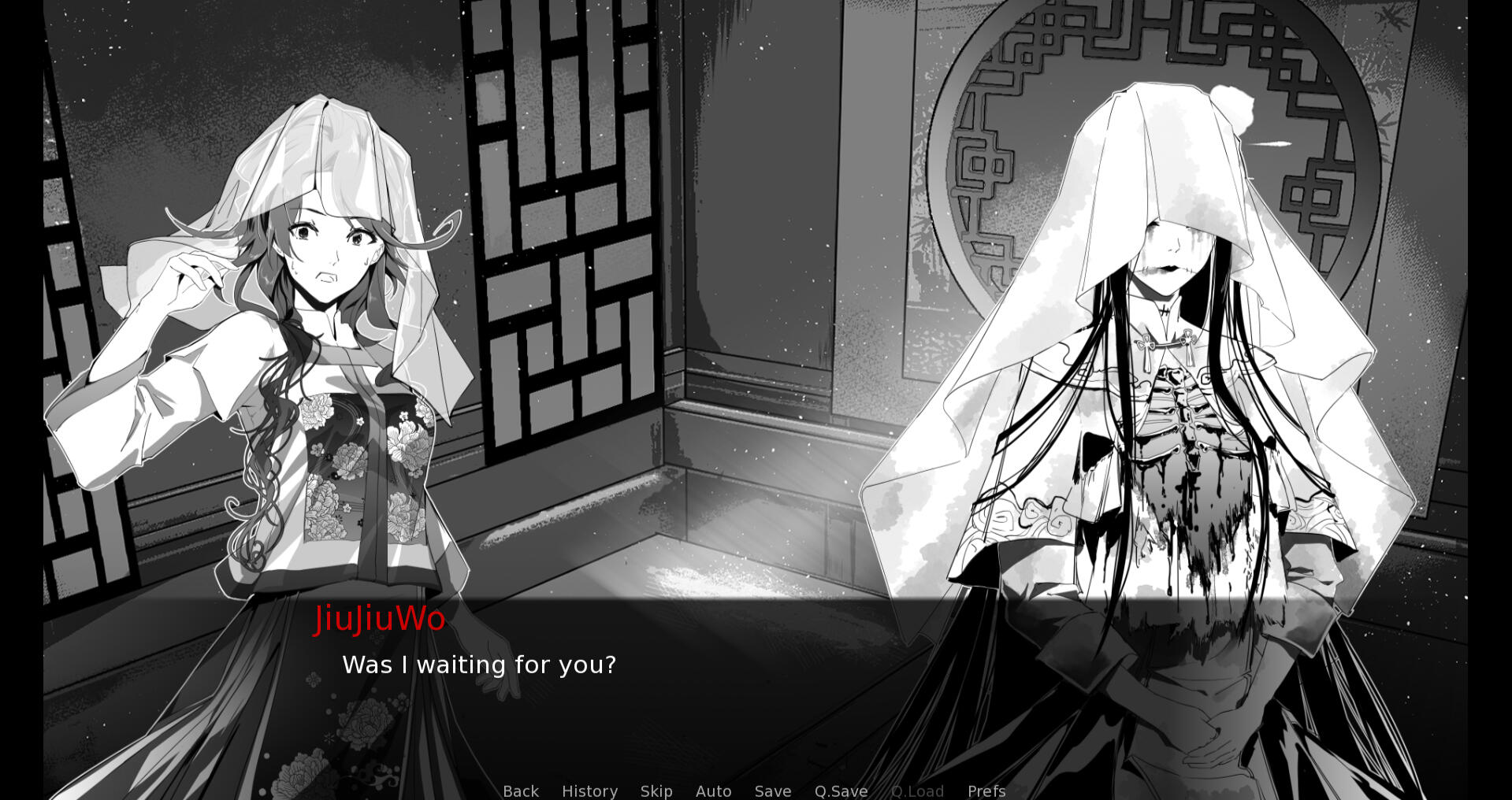
Genre: Turn-based visual novelInferno is a 2D, turn based, interactive novel, where players play as Cain, an angel sent to retrieve his lover and kill Lucifer. Roll your dice, defeat your enemies with the holy sword or kindness, and get companions to accompany you through the journey towards the 9th circle of Hell. Reach the final circle, and learn who you truly are.
Heart of the Arsenal
VFS Game Jam | June 2023
Genre: Single-player, aim-trainer, dating simShoot to impress in this aim-trainer dating sim, where you play as a humanoid gun trying to join a group of elites to win the love of your life.
Fishy Business
VFS Student Final Project | April 2023 - August 2023
Genre: Online, free-for-all, party, multiplayer gameOn the frozen glacier, there are no laws. In this 3D, online, party game, players play as a penguin parent, who is trying to make sure that their babies are well fed. Fish the fishes or steal them from others, but make sure that your baby is well fed to become the ultimate penguin parent.
Stop and Go
Emily Carr Student Final Project | September 2021 - April 2022
Role: Director
Genre: Cute short 2D animationIn a world where robots have achieved free-will, Pappy, the school patrol robot, realizes that all is not as it seems to be.
Fishy Business
Fishy Business was created in Unity and all the VFX was made through the Unity VFX Graph.
Diving Splash
The splash when the penguins dive into the water. I created the splash by having two effects working together: the vertical splash when the penguin hits the water, and the foam that comes after to leave a trace from the dive.
Golden Circle
This golden circle shows up when there is an earthquake event; the circle indicates the safe zone. I created the golden sparkle to emit up from a circle and made the base of the circle golden to clearly indicate where the safe space is to players.
Rain
The rain that falls when there is a storm coming in the game. Rain was created through two particle systems: the falling rain and the circular droplets in the water.
Art Direction
I was heavily inspired by "OFF" by Mortis Ghost, the "Divine Comedy's" illustrations by Gustave Dore, and Japanese manga art style for this game. I wanted to make the game have the melancholy feel of OFF and Gustave Dore's illustration, but also have the flair of joy from the characters in manga, as a large pillar of the game is about light and darkness/good and evil. I wanted to have balance in the art style through having the background be inspired by Gustave Dore, the characters be manga styled, and using the same colour balance from OFF.
Character Design
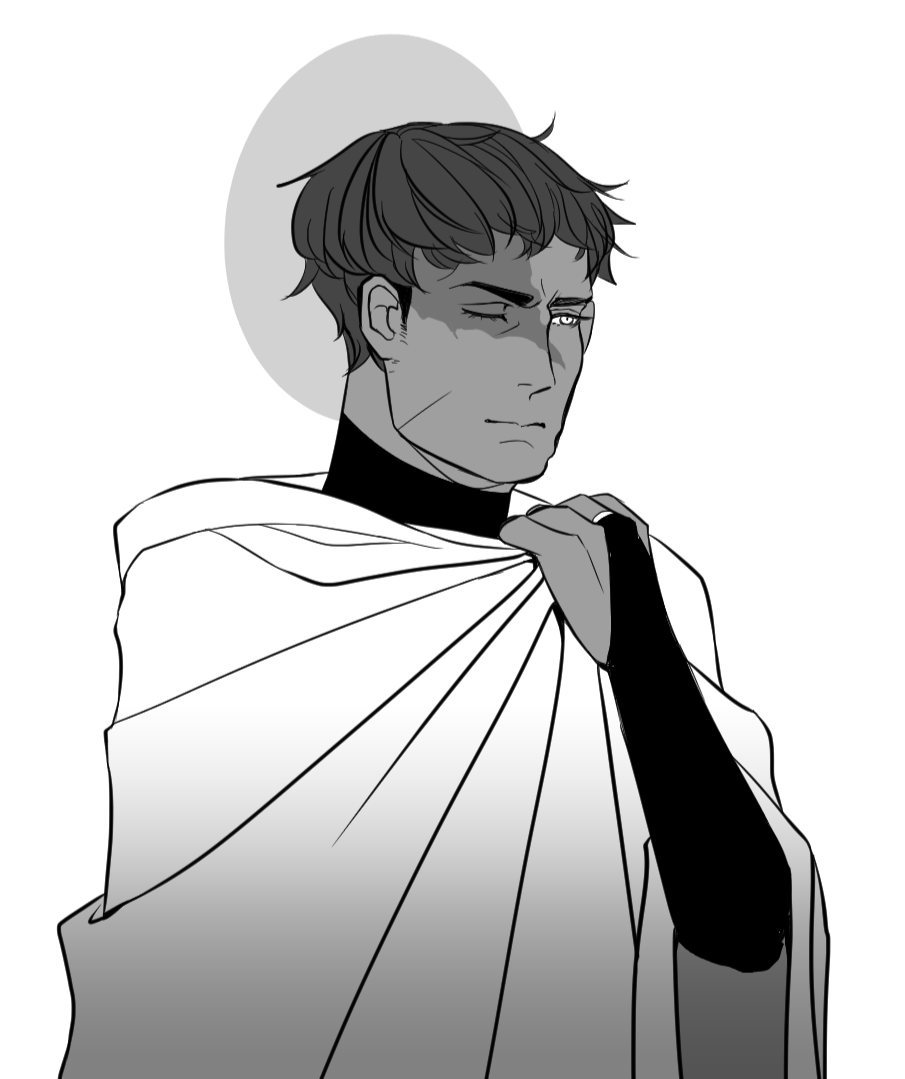
Cain - Protagonist
Cain is the angel that players play as he descends through Hell. When I was brainstorming what Cain would look like, I was heavily inspired by Guts from "Berserk" because of the serious tone that Guts give off. I wanted that feel for Cain, so I gave him a more mature look and slightly messy hair to juxtapose his sharp features. Cain also symbolizes the role of Dante from "Dante's Divine Comedy;" so I gave him a large robe, that Dante wears in paintings, to push the role on the character.
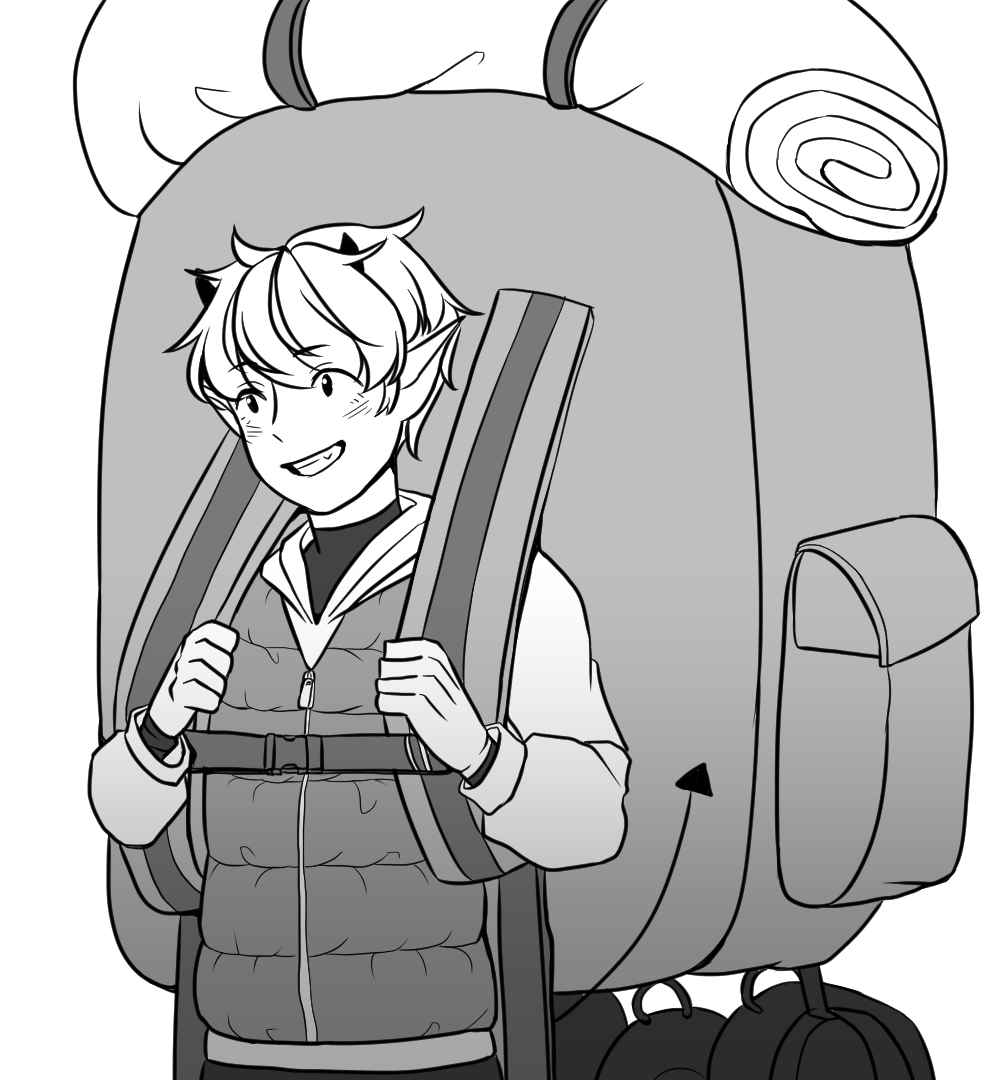
Cheshire - Sidekick and Mentor
Cheshire is the first demon that Cain meets, and lead him through the circles of Hell. I wanted Cheshire to be the antithesis of Cain, so I designed him to contrast Cain's whole being and made everything about him feel friendly, but slightly mischievous; this was done by making his bag far bigger than it needs to be, and giving him cat features like his eyes and little fangs on his teeth.
Gameplay Mock-up
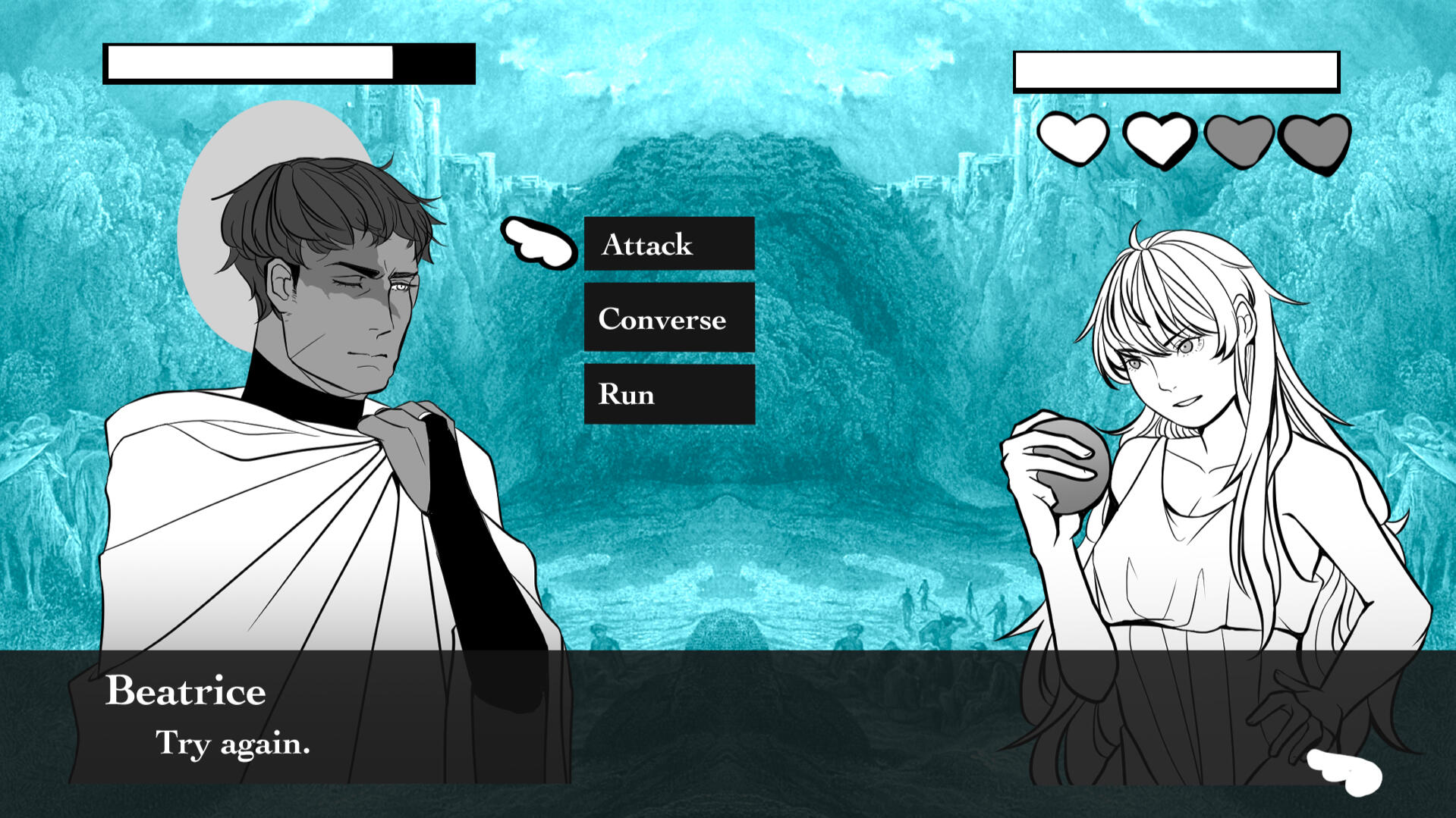
This was a quick mock-up I've done for the game, as I explore ways to layout the game. I wanted the game to look like a Japanese visual novel, but with the option to fight every character at any moment. In the mock-up, I have Cain on the left and Beatrice on the right. The left and right positioning is based from "Fire Emblem Awakening" dialogue , and renaissance art history on character positioning, as right is considered good and left is considered bad.
Background
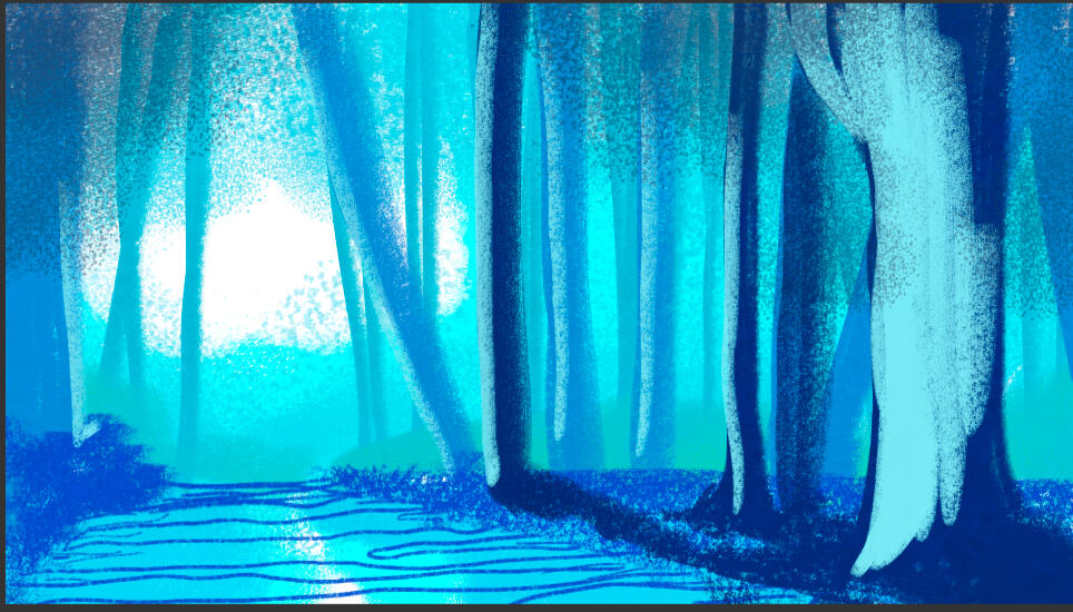
Limbo - Sketch
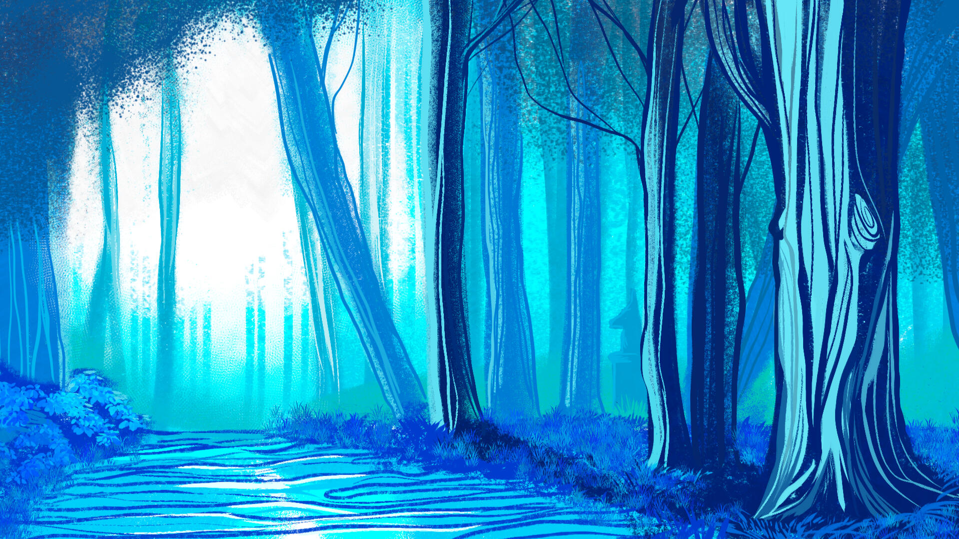
Limbo - Final
This is the background for the beginning scene of the game - 1st Circle of Hell: Limbo. In "Dante's Inferno," he described the first place that Dante landed was at the foot of a mountain in a forest. I wanted the forest to look like Gustave Dore's illustrations, but when I tried putting Gustave Dore's illustrations against my characters, the details of the background were distracting and pulled away from the characters. I simplified the backgrounds, by reducing the details in the leaves and elements in the distance. The colour was chosen due to the saturated look of "OFF's" backgrounds, and the coldness of the forest that I wanted to convey. I placed the light on the left side of the screen, as Cain would be positioned there throughout the whole scene, and makes him shine with divinity.
Art Direction
The whole inspiration of the art direction is gun themed dating sim, but with a queer twist. I was inspired by multiple western dating sims like "Dream Daddy" and "Monster Prom," that had queer romance options; and Japanese dating sims, specifically the genre Otome -- dating sims made for women. I based the look of the characters to have the same visual appeal in Otome, but clearly have queer influences through the use of colour. All the characters were heavily inspired by "Chainsaw Man," as we identified that the market does not have a weapon-head based dating sim, and we thought we should correct that.
UI/UX
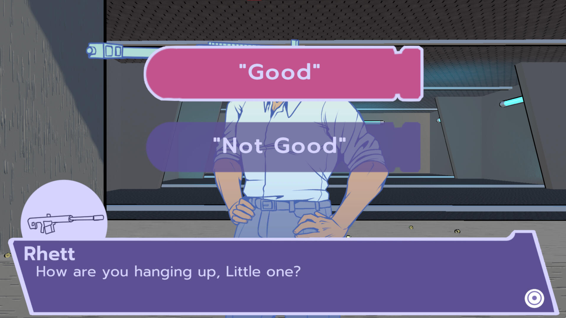

Dialogue
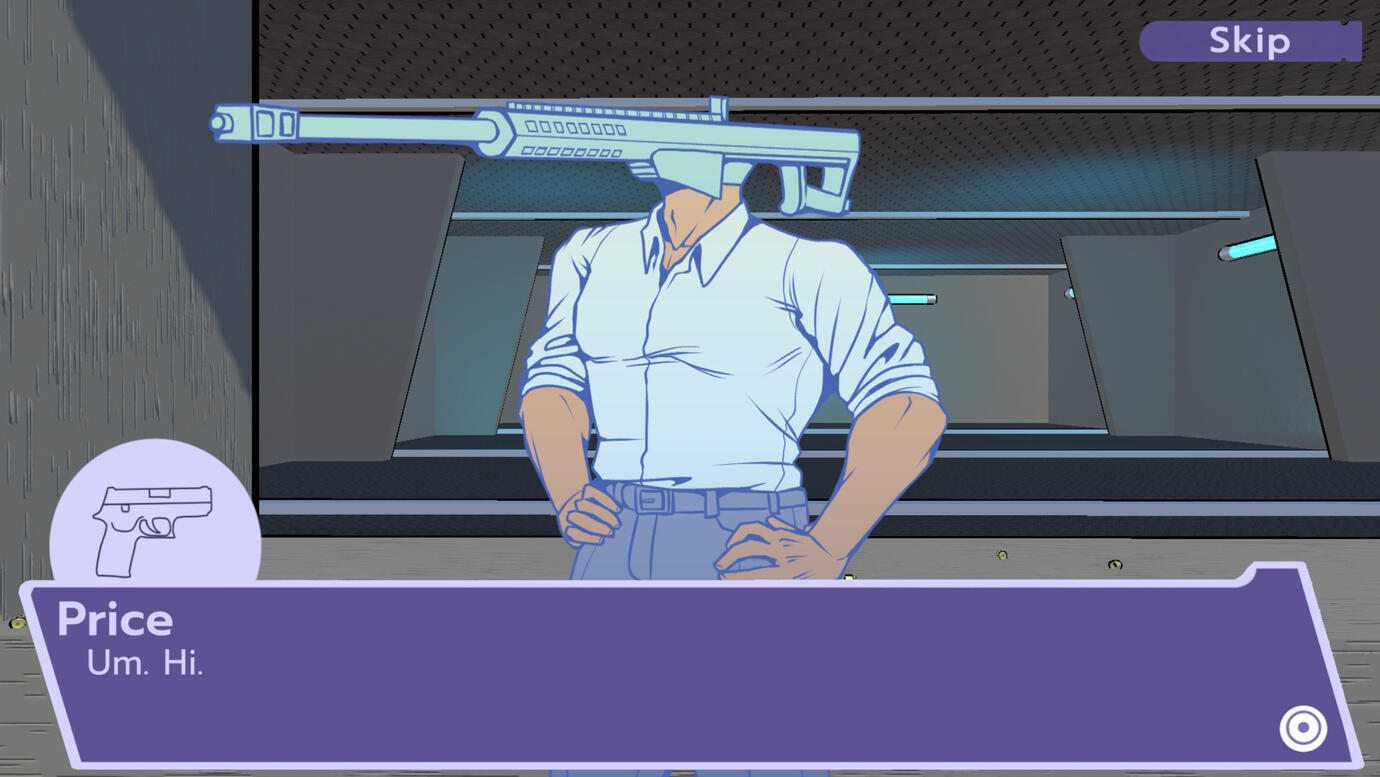
In the game, the player plays as a gun man, dating gun people; I thought it would be fun to make gun themed interfaces. Everything in the interface is related to a gun, one way or another: the dialogue box is a magazine, the choices are bullets (because the player is "shooting their shot" hahaha), the character portraits are guns, and the symbol to represent finished dialogue is a target. The colours was connected to our main character, as our character represent purple and is bisexual.
Character Design
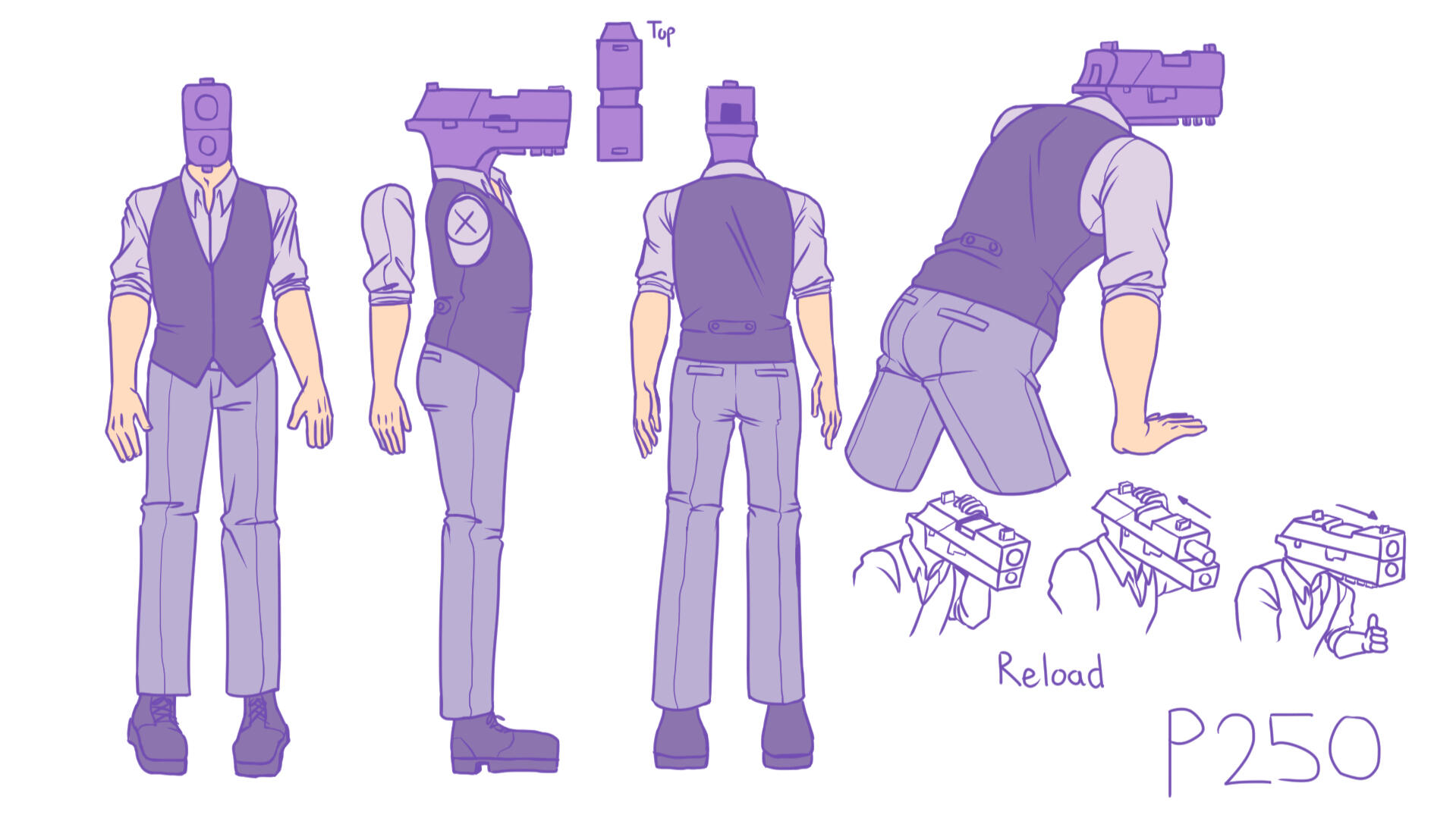
P250 - Protagonist
This is our main character's turn around sheet; he is the only character to have a turnaround sheet, as he is the only one that is 3D modelled to shoot targets. One of the design challenges for his was his reloading; he shoots from his head, but where does he reload from? Normal P250 reloads from the bottom, and his bottom is his neck. However, I realized that he has bullets in his body to shoot the bullets, so I made his head where he can prime for more bullets.
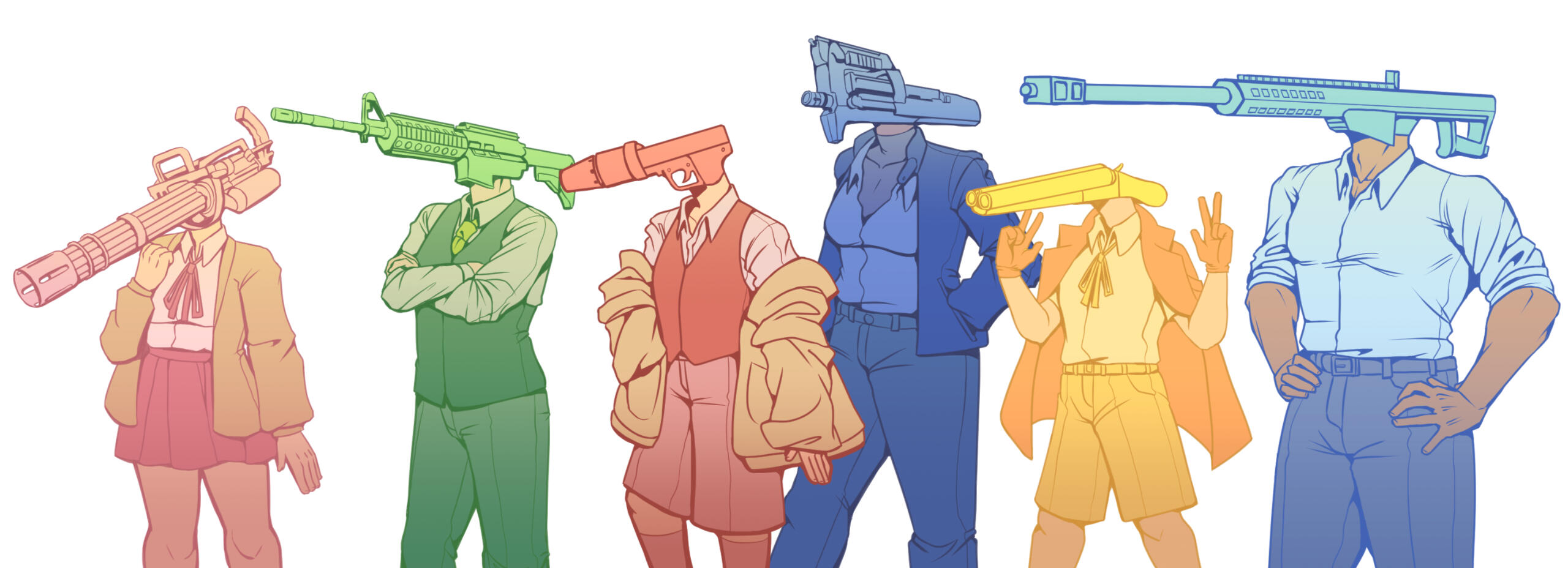
The Romance Options
Our team had 5 days until submission, and everyone wanted 6 romance able options -- I designed all 6 characters within 2 days. The challenge in designing 6 characters is ensuring that each one is unique to each other, and stand out from one another. Due to each character being a personification of a gun, I had inspiration based on the history of their use and creation. I would search up each gun about how they are used, why they are used, what their history is, and create personality from the details given. Research made the character designs easy, as formulated their personality for me, and I just had to design their look.
Art Direction
We took heavy inspiration from the cartoon look Party games, such as "Mario Party" and "Overcooked," and plush toys, like "Squishmallows." The game was targeted for younger audiences, so we made everything in the game to be cute and adorable visually, through simplifying the visual design of everything.
Logo
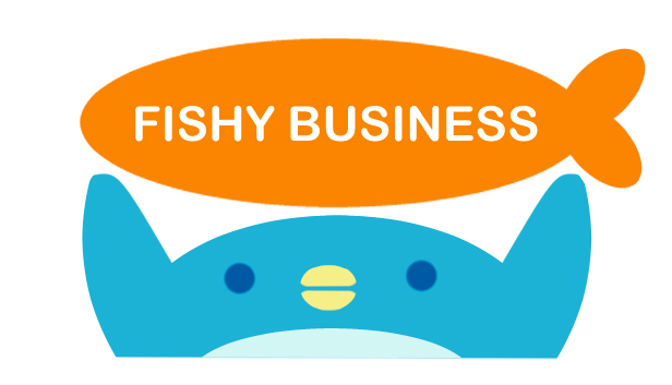
Old Logo
This was our old logo of the game. Our teachers found the logo to be lacking as it does not show the nature of the game, and did not attract users to play our game.
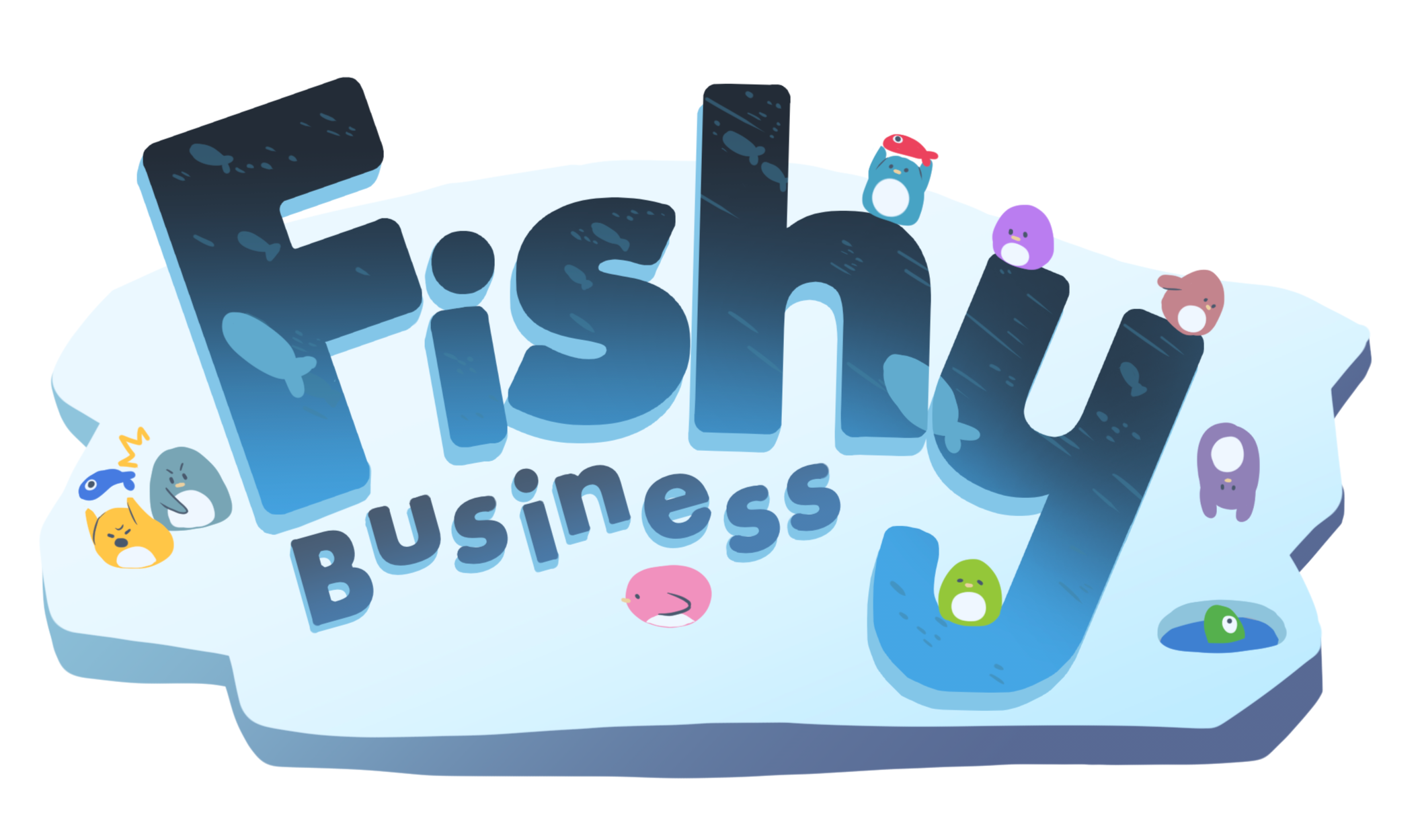
Current Logo
This was our current logo. The previous logo's weakness was the lack of chaotic and cute energy the game had, so I pushed it in our redesign. When designing this logo, I wanted users to see the logo and understand what the game is about instantly. I integrated the core loop and the main mechanics of the game, through the penguins around the title, and set a glacier in the background to show the setting of the game.
UI/UX
When showing the game, I noticed that all the viewers enjoyed the UI when there is a penguin -- So I placed penguins everywhere. Every screen, in this game, has a penguin.

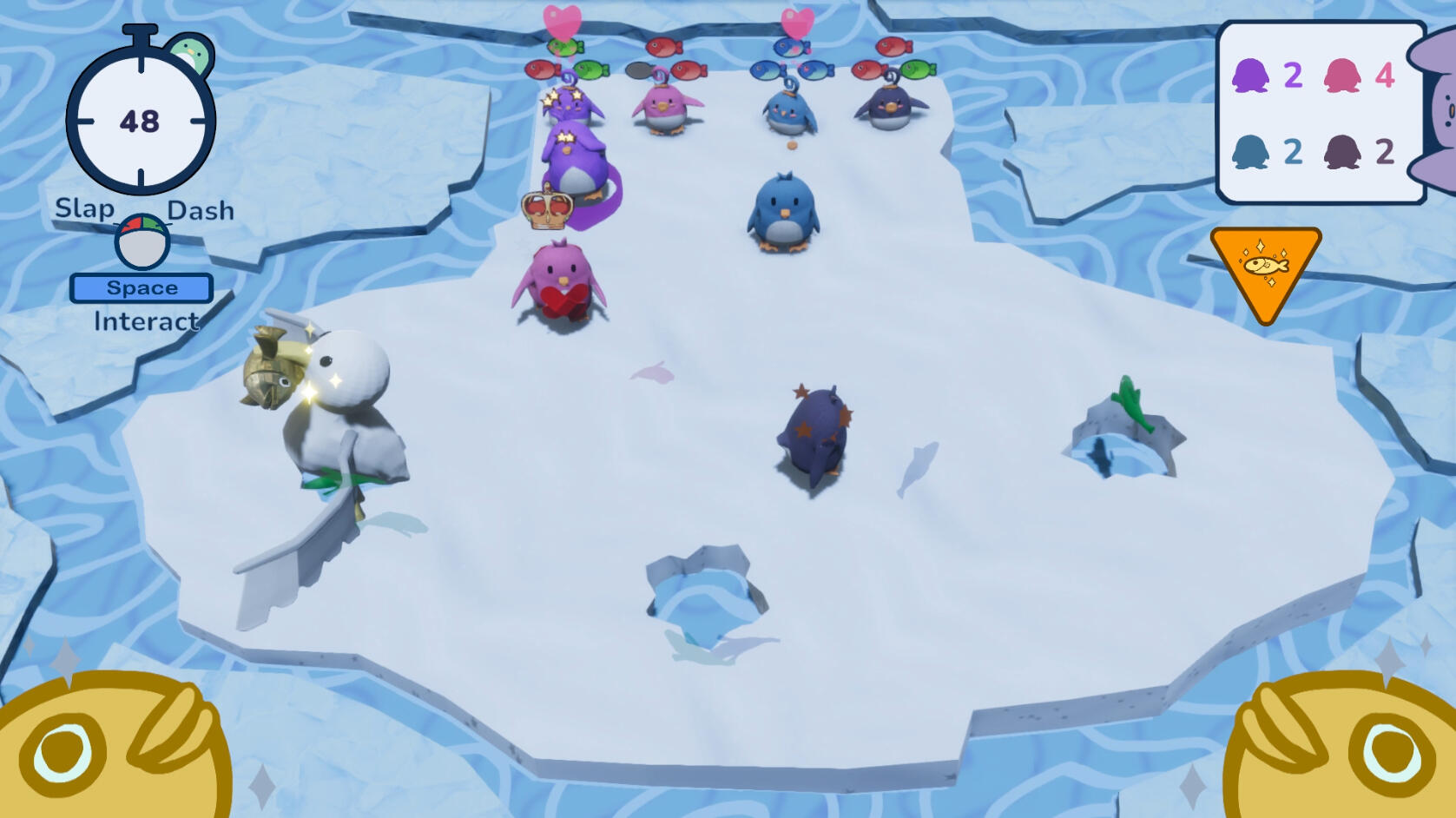
Gameplay HUD
I was responsible for designing the HUD of the game, and there were elements that the players needed to know based on the HUD: the time of the game, what each baby wants, who is winning, what event is occurring, and what are the controls. I organized all the UI to show up on the outside of the screen, to minimize any information being blocked by the HUD for the players. The rest of the set up was making each element have a penguin.
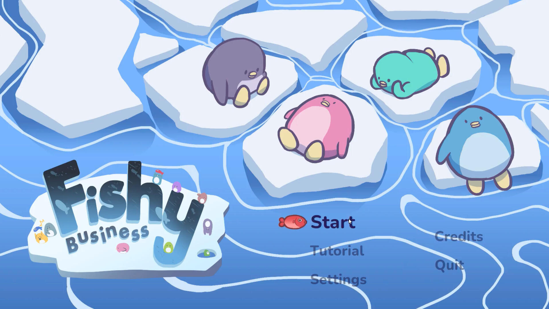
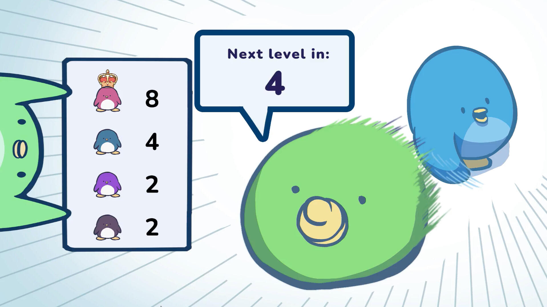
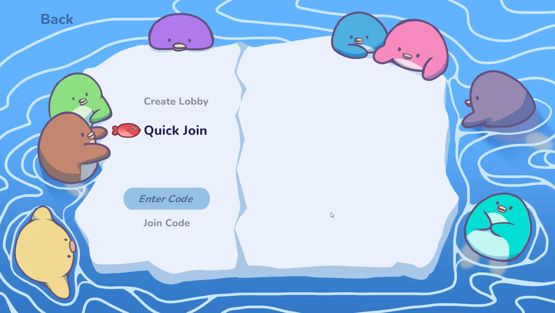
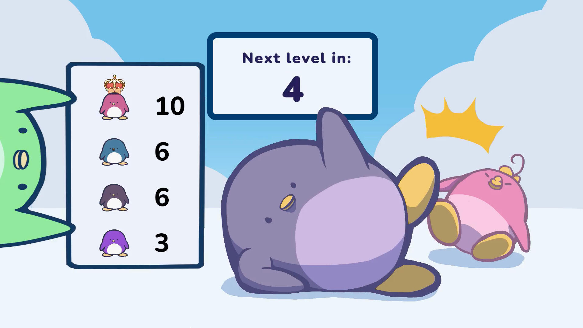
Menu Splash Screens
In the game, I made multiple splash screens for the game's menus. I wanted the menus to convey the relationship between the penguins, as the main gameplay does not focus on the story of the creatures. In the design, I had a little section on each penguin's history and I thought it would be fun to go through the narrative in the menu screens. As I drew each splash screen, I would place the penguins into scenarios to explore each penguins' personality.
Art Direction
A big part of the story was the juxtaposition between expectation and reality of the world. We wanted to push that in the style of the animation too: the visuals would look cute and innocent, while the story and the animation would directly oppose that.
Trailer
When creating the trailer, I wanted to showcase the key dynamics between the characters and who is the main character. I did so by picking the shots that show the interaction of the main character and the other characters: shot 1 is the main character with the majority, shot 2 is the main character with the little girl, and last shot is the main character with themselves. The three shots represented the relationship challenges that the main character faces in the story.
Animation Workflow
This is the workflow I followed throughout production. I would first do a rough layout sketch of the animation flow, and let that guide the positioning and dynamic of the animation.
